Overview
The problem
Thousands of games are available on the Nintendo Switch eShopThe official digital game store on the Nintendo Switch video game console., however, users struggle to find quality games to play. The project goal was to promote discovery by making it easy to narrow down selection and gauge quality. It was expected that improving discovery would also increase the amount of time users spend in the eShop.
The solution
Strategies to personalize the discovery and evaluation phases of the user journey were implemented, including a tunable homepage feed and a category-based rating system.
My role
The project was self-directed and completed individually. I followed the design thinking process and took on the role of UX designer.
Stage 1: Empathize
Sort and Measure
What did I do?
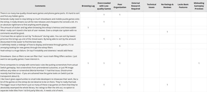
I used the sort and measure method to analyze a forum post in which members shared their experiences with the Nintendo Switch eShop. The post was sourced from Reddit’s Nintendo Switch subredditReddit is a discussion website with communities dedicated to particular topics known as ‘subreddits’..
How did I do it?
- I searched the subreddit for relevant posts using terms such as “eShop design” and “eShop experience”.
- I vetted the post using the following criteria:
- Date posted: Was it recent enough to reflect the current state of the eShop?
- Discussion level: Was the discussion lively and among multiple unique members?
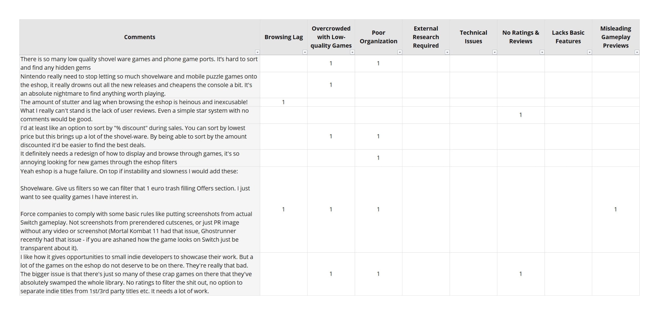
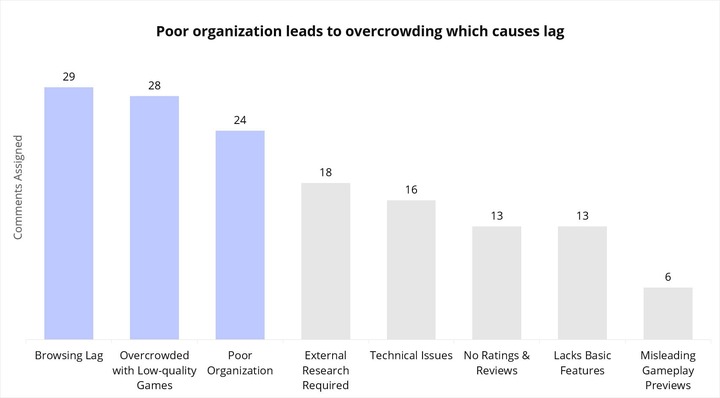
- I exported the comments (97 total) to a spreadsheet, generated categories from the content, and assigned each comment to one or more category.
- I totaled the number of comments assigned to each category.
Why did I do it?
My goals were to reduce and interpret the post so that I could:
- identify user intentions,
- discover the attitudinal and behavioural response of the user,
- uncover the emotional state of the user, and
- detect relationships in the data.
What was the result?
- Users intend to find a quality game they will enjoy playing.
- Users perceive that Nintendo is lazy. In response, they do their own research to find a game and then use the eShop to buy it.
- Users get overwhelmed, hopeless, disappointed, and frustrated while using the eShop.
- A causal relationship was observed between the top categories that emerged. Poor organization leads to overcrowding which causes lag.
What did I learn?
Expectation mismatch is negatively impacting the user experience. Users launch the eShop with the intention of finding a quality game to play, however, they struggle with discovery.
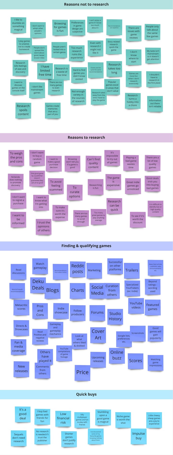
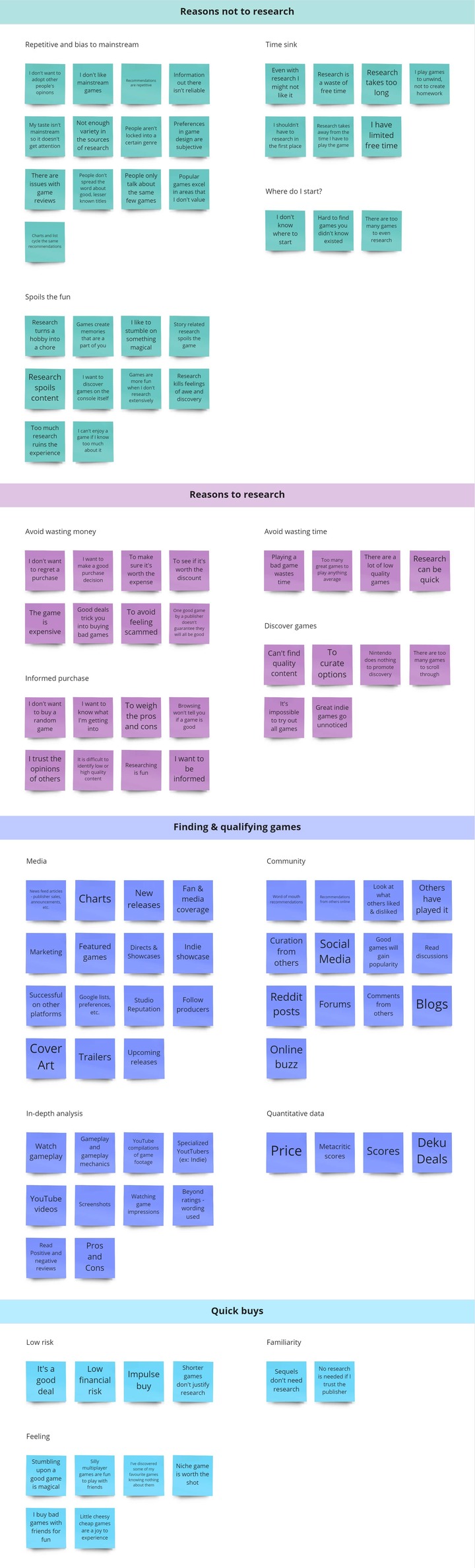
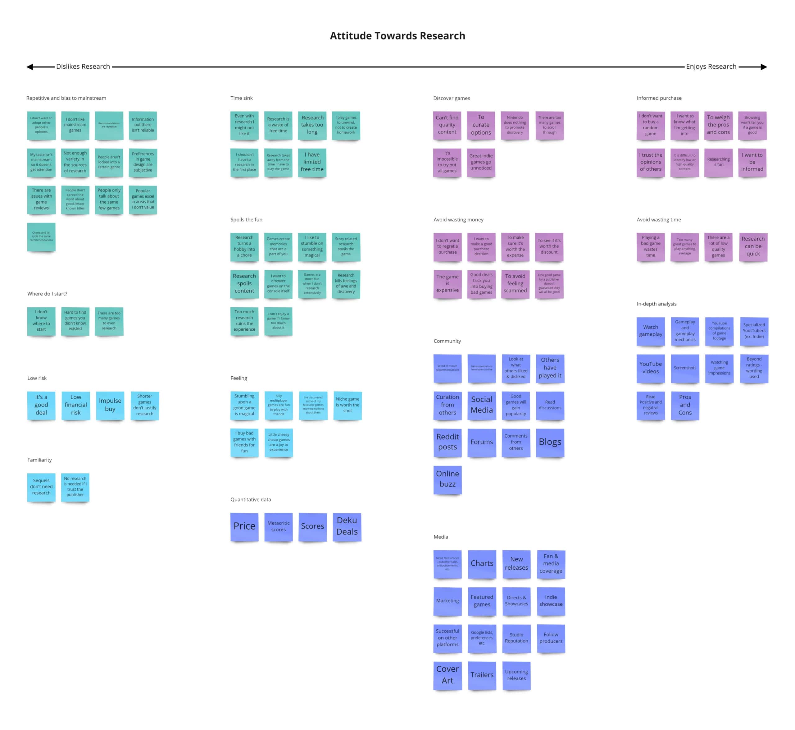
Affinity Diagramming
What did I do?
I produced an affinity diagram from a forum post in which members discussed their strategies for finding games for the Nintendo Switch. The post was sourced from Reddit’s Nintendo Switch subreddit.
How did I do it?
- I searched the subreddit for relevant posts using terms such as “tips for finding games” and “find new games”.
- I vetted the post using the following criteria:
- Date posted: Was it recent enough to reflect current user actions?
- Discussion level: Was the discussion lively and among multiple unique members?
- I copied comments (114 total) onto sticky notes and did two rounds of sorting:
- a quick initial sort to spot overarching themes, and
- a revised sort of the themes into sub-themes.
Why did I do it?
My goals were to:
- figure out what users need to find games,
- determine how users qualify games,
- detect behavioural patterns, and
- spot relationships in the data.
What was the result?
- Users need curation to find games.
- Users qualify games by checking if they excel in the game elements they value.
- Attitude towards research influences user behaviour:
- Users who enjoy research tend to research extensively and want to know the ins and outs of a game before making a purchase.
- Users who think research is a waste of time tend to buy impulsively and would rather spend time playing a game even if they end up not liking it.
- Users who research out of obligation tend to research just enough to feel confident that they are making a smart purchase decision.
- For users who research out of obligation, an inverse relationship was identified between research and enjoyment. Too much research reduces enjoyment because it spoils the gaming experience.

What did I learn?
Users who research out of obligation will need to be prioritized. These users turn to research because they can’t find games, however, their research reveals spoilers. Consequently, user intention – to find a quality game that’s fun to play – can’t be satisfied.
Empathy Mapping
What did I do?
I created an empathy map to visualize Chris, the prioritized user type (users who research out of obligation).
How did I do it?
- I extracted quotes from comments in the forum posts I analyzed ("Says").
- I contemplated the mental process preceding the comments ("Thinks").
- I identified action words in the comments ("Does").
- I considered the emotional context of the comments and the emotions created by the user’s actions ("Feels").
Why did I do it?
My goals were to:
- determine Chris’s thoughts and feelings when searching for a game, and
- recognize Chris’s needs and expectations for the eShop.
What was the result?
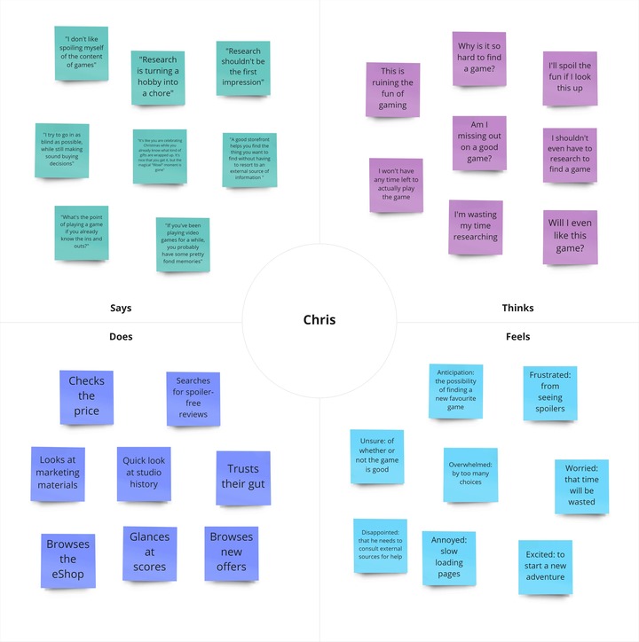

What did I learn?
- Gaming connects Chris to his inner child.
- Anticipation for feelings of awe, wonder, and joy is triggered when Chris envisions playing a game.
- Chris feels nostalgic for childhood shopping trips to the game store, a time where he picked games based on cover art and what seemed like fun.
- Chris expects the eShop to pique his interest while browsing.
User Journey Mapping
What did I do?
I constructed a retrospective user journey map to visualize the process Chris goes through when he needs a new game to play on his Nintendo Switch.
How did I do it?
- I extracted user actions from my research and arranged them in chronological order.
- I drew a line to illustrate the emotional highs and lows of the journey, referencing the thoughts and feelings defined in the empathy map I created.
Why did I do it?
My goals were to:
- pinpoint where in his journey Chris faces problems, and
- identify opportunities for addressing Chris’s pain points.
What was the result?
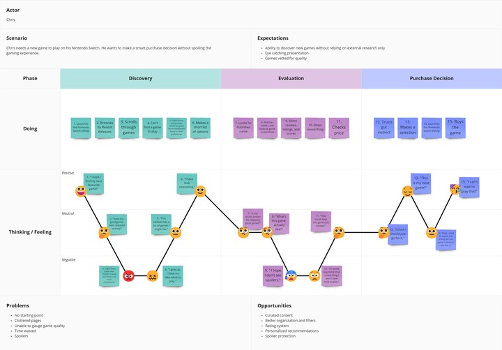
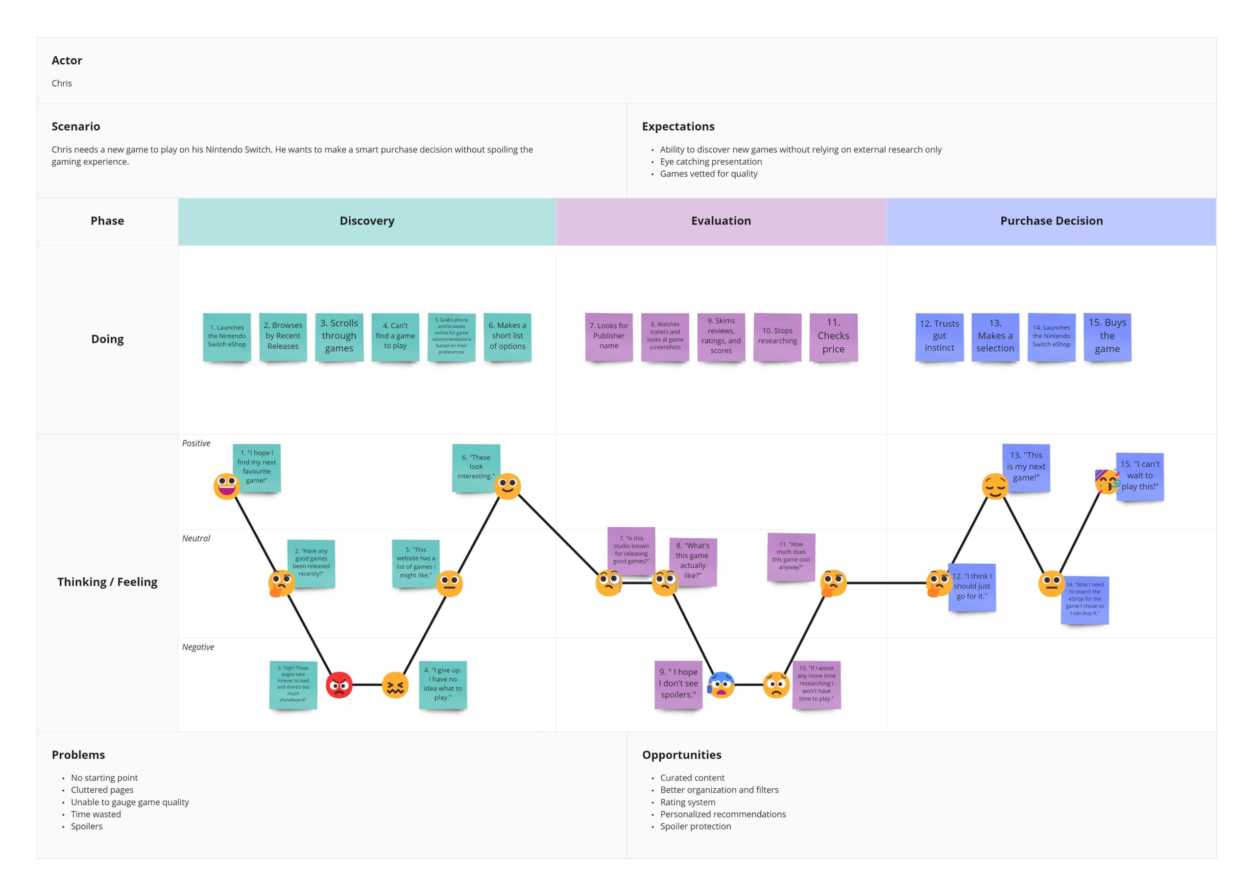
What did I learn?
- Chris abandons the eShop early in the Discovery phase of his journey because he gets overwhelmed by the selection of games.
- Chris initially uses research not to evaluate a game he found, but to find the game in the first place.
- Chris worries he’ll waste time by falling down a research rabbit hole.
- Chris gets frustrated when he sees spoilers while researching.
Stage 2: Define
User Persona
What did I do?
I defined a user persona to represent Chris, the prioritized user type in this project (users who research out of obligation).
How did I do it?
- I referenced my research findings and empathy map.
- I reviewed results from the latest demographic survey administered to members of Reddit’s Nintendo Switch subreddit (moderators of this subreddit periodically run community surveys to learn about their members).
- I watched gamers on YouTube for more information, such as background details and quotes.
Why did I do it?
My goals were to:
- outline behavioural patterns that need consideration, and
- define the goals that motivate Chris to play video games.
What was the result?
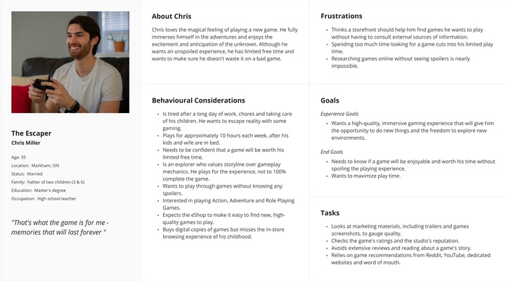
What did I learn?
- As a working parent, Chris doesn’t have a lot of time for gaming and any time spent finding a game cuts into the time he has to play it.
- Chris gets frustrated by spoilers because he plays to escape reality. He isn’t able to immerse himself in the game when he already knows what will happen.
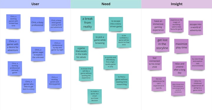
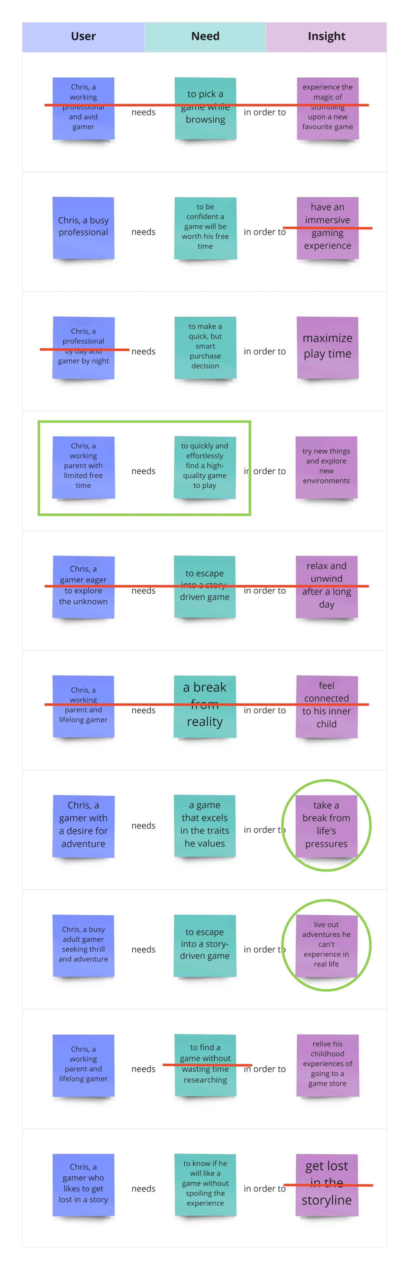
User Need Statements
What did I do?
I wrote three user need statements:
- an overarching parent statement that summarizes Chris’s ultimate goal, and
- two narrower statements that can be addressed within the scope of this project.
How did I do it?
- I reviewed my research findings.
- I produced options for each of the three fragments that make up a user need statement (the user, the need, and the insight) and wrote them on sticky notes.
- I mixed and matched the fragments to form complete statements.
- I selected the combinations that best reflected Chris’s needs.
Why did I do it?
My goals were to:
- define the right problem to solve, and
- eliminate uncertainty from the Ideation Phase.
What was the result?
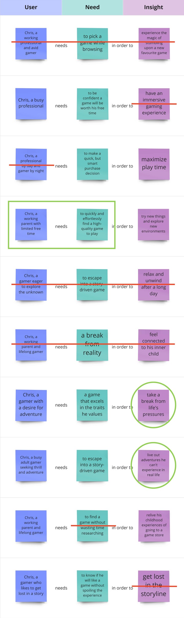
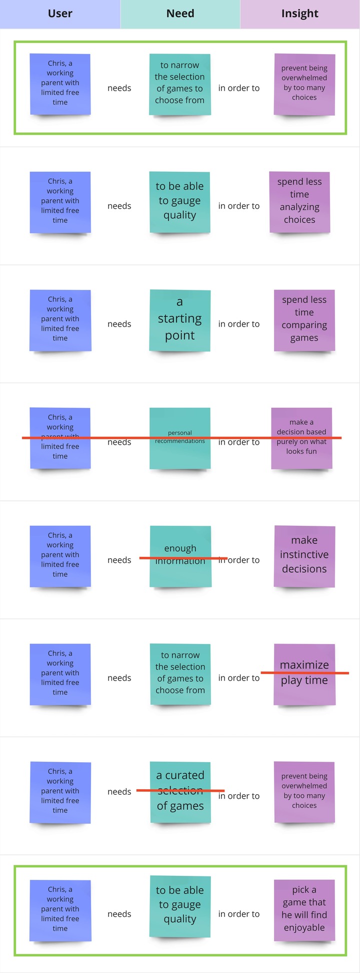
User need statement #1 (parent scope)
Chris, a working parent with limited time for hobbies, needs to quickly and effortlessly discover high-quality games to play in order to take a break from life’s pressures and live out adventures he can’t experience in real life.
User need statement #2 (child scope)
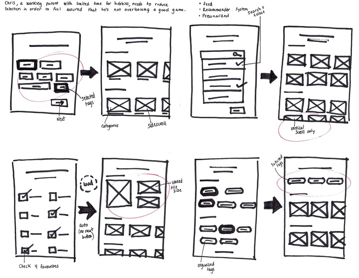
Chris, a working parent with limited time for hobbies, needs to reduce selection in order to feel assured that he’s not overlooking a good game.
User need statement #3 (child scope)
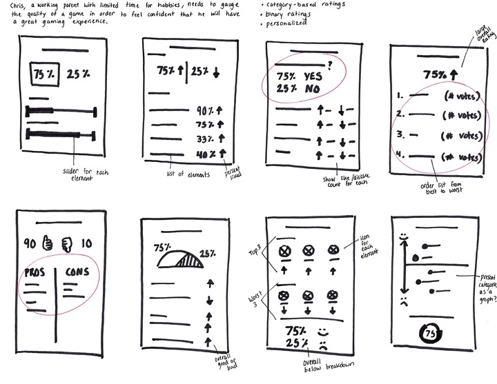
Chris, a working parent with limited time for hobbies, needs to gauge the quality of a game in order to feel confident that he will have a great gaming experience.
What did I learn?
To enhance the user experience, the redesign of the eShop will need to promote the quick and effortless discovery of quality games by:
- making it easy for Chris to narrow down his choices, and
- supporting Chris as he evaluates the quality of a game.
Stage 3: Ideate
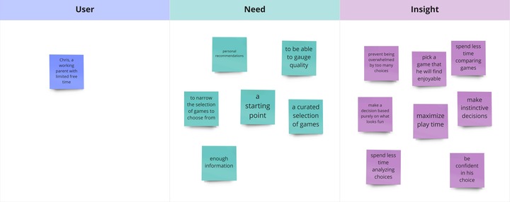
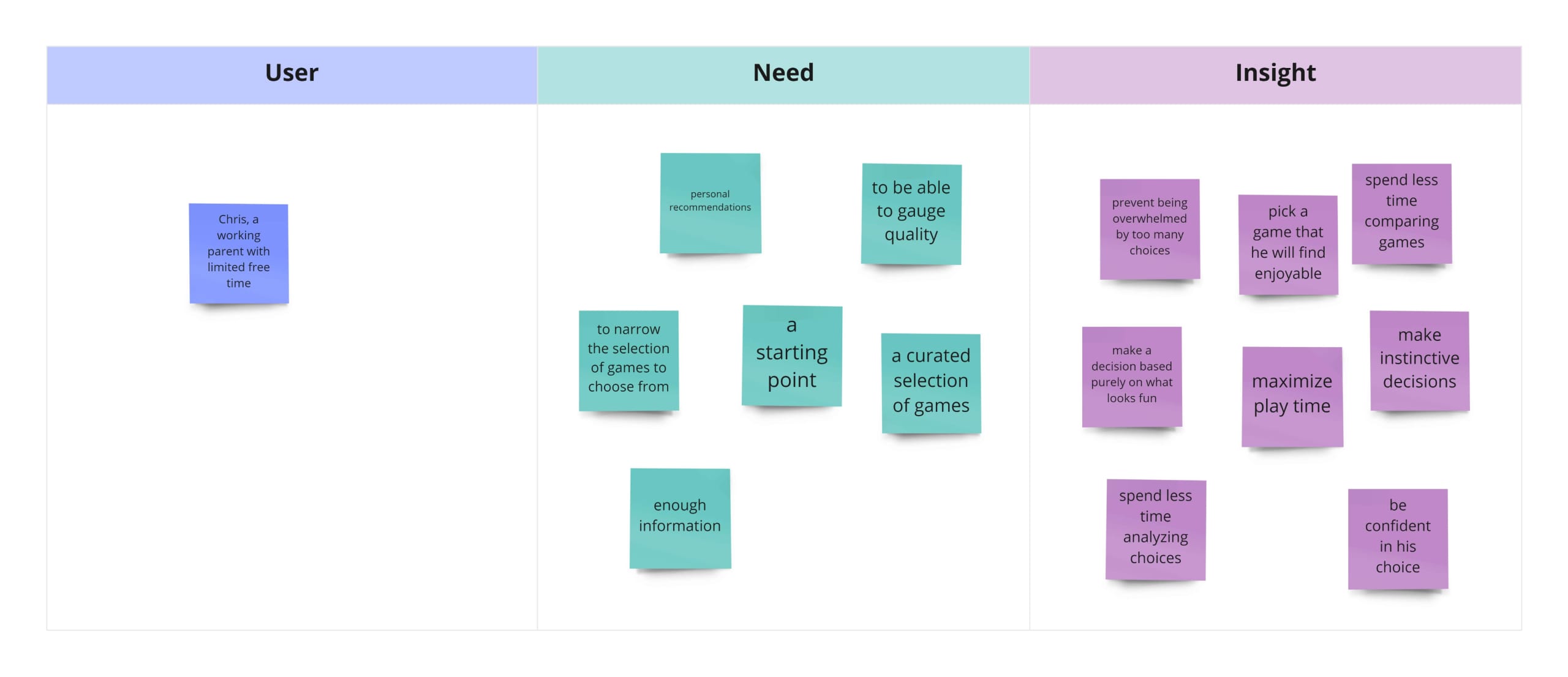
Braindump
What did I do?
I did a braindump focused on the in-scope user need statements that I defined in Phase 2.
How did I do it?
- I set a 10-minute timer and wrote down as many ideas as I could think of on sticky notes.
- I sorted my ideas into common themes.
- I identified the ideas that I should explore further.
Why did I do it?
My goal was to get all the preconceived ideas out of my head so that I could think freely throughout the Ideation phase.
What was the result?
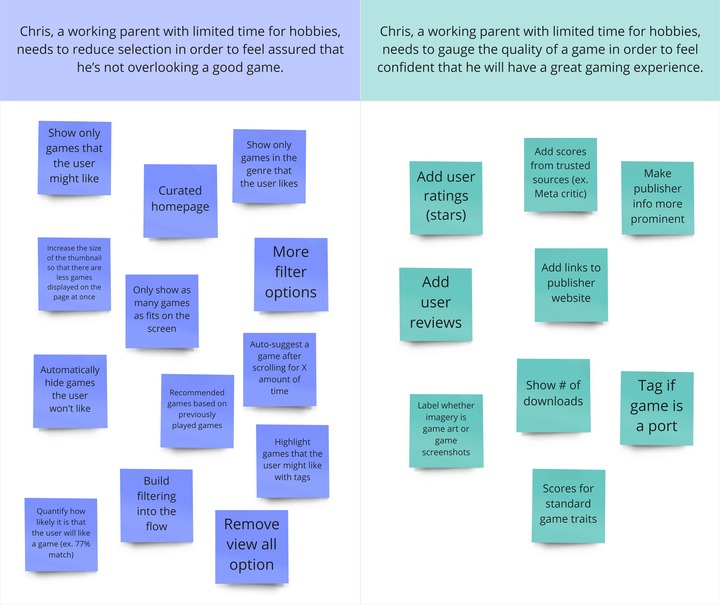
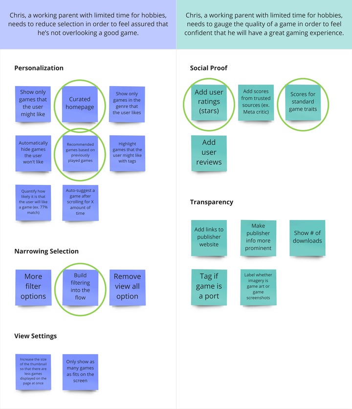
What did I learn?
Ideas that enable personalization have the potential to address Chris’s needs. For example, personalizing discovery with a curated homepage or personalizing evaluation with game element scores.
SCAMPER
What did I do?
I used the SCAMPER brainstorming method with a focus on the in-scope user need statements.
How did I do it?
I repeated the following steps for both user need statements:
- I placed a user need statement in the center of a mind map and added a branch for each element of SCAMPER.
- I set a 3-minute timer per element and wrote down as many ideas as I could think of.
Why did I do it?
My goals were to:
- approach the problem from many different perspectives, and
- further explore the best ideas from the braindump.
What was the result?
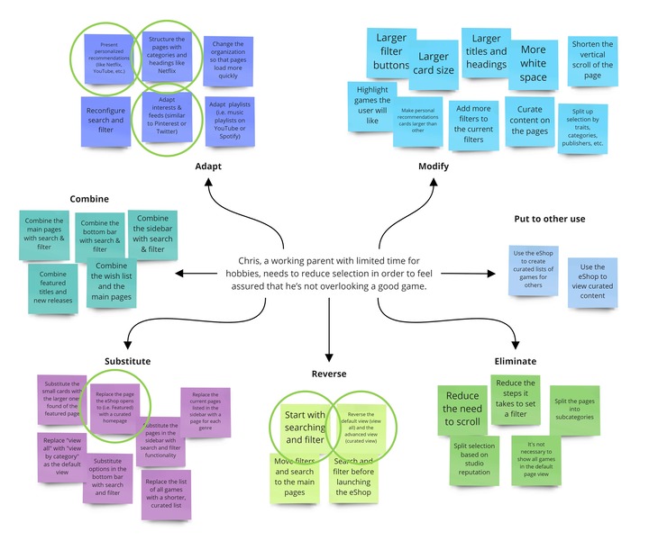
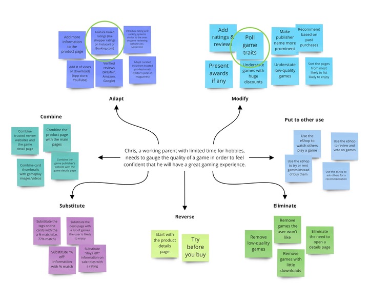
What did I learn?
- A tunable homepage feed could reduce the selection of games presented to Chris.
- Adapting a category-based rating system and combining it with a binary rating system is likely to help Chris assess quality.
User Flow
What did I do?
I created a user flow diagram that visualizes the path Chris would follow through the eShop to select and purchase a game if a tunable feed and a rating system were implemented.
How did I do it?
- I referenced the user journey map and user need statements to review what Chris needs and when.
- I wrote an outline, breaking down the user flow into three parts: the starting point, the process, and the result.
- I made a flowchart from the outline.
Why did I do it?
My goals were to:
- track the screens that Chris would see,
- analyze how Chris would interact with each screen, and
- optimize ease of movement through the eShop.
What was the result?
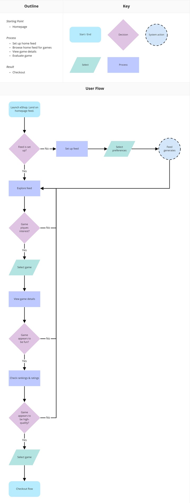
What did I learn?
There are three points in the flow where Chris could loop back to his homepage feed and continue browsing. To prevent Chris from getting stuck in a loop, I believe the feed should be bounded (i.e. no infinite scroll).
Crazy 8’s
What did I do?
I used the Crazy 8’s sketching technique to illustrate the tunable homepage feed and the rating system.
How did I do it?
I repeated the following steps, once for the feed and again for the rating system.
- I folded a piece of paper into eight sections.
- I set an 8-minute timer and sketched one idea per section.
- I identified the best ideas.
Why did I do it?
My goals were to:
- generate many ideas in a short period of time, and
- identify elements to combine into a prototype.
What was the result?
What did I learn?
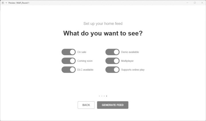
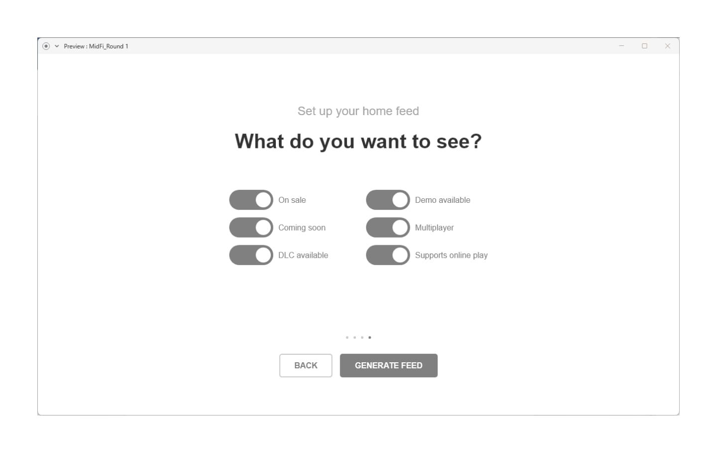
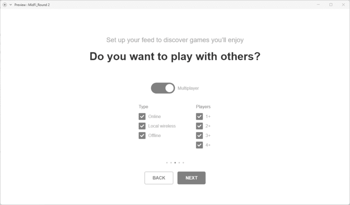
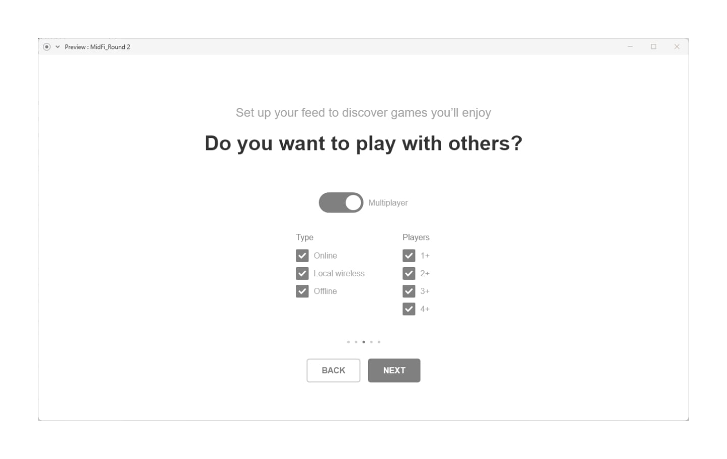
- Limiting the number of interests that can be chosen during the feed set up should keep the selection manageable for Chris.
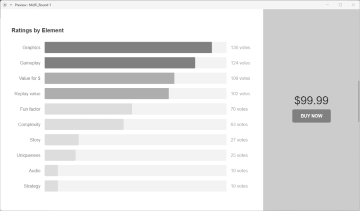
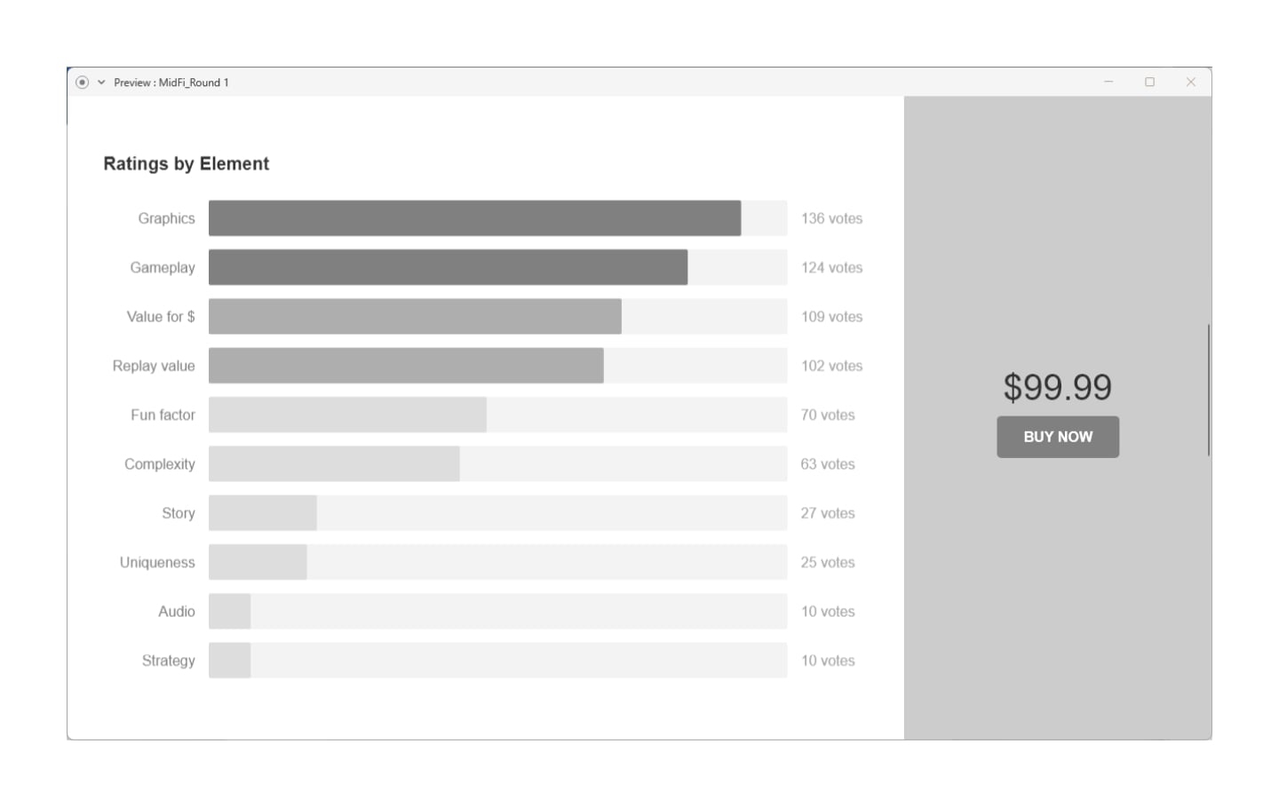
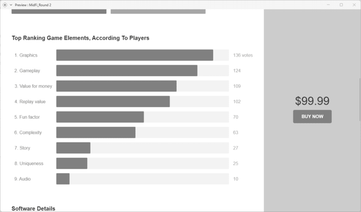
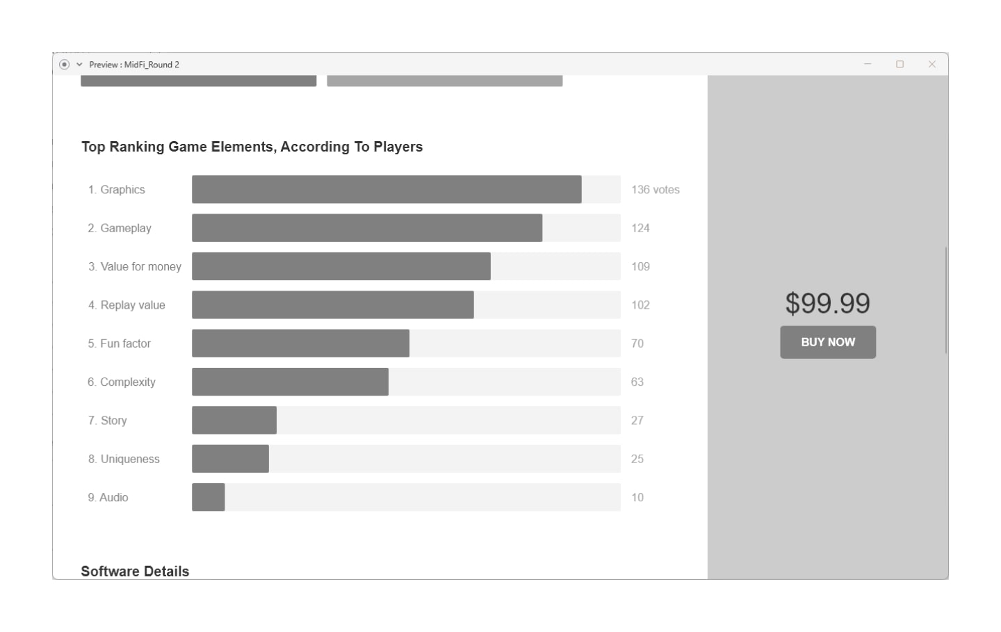
- An ordered chart should quickly show Chris the ranking of his preferred game elements.
Stage 4/5: Prototype/Test
Mid-Fidelity Wireframes & Usability Testing
What did I do?
I did two rounds of wireframing, usability testing, and revisions.
How did I do it?
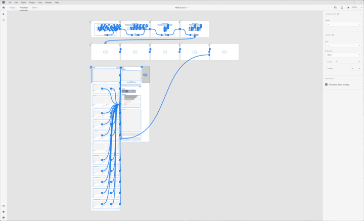
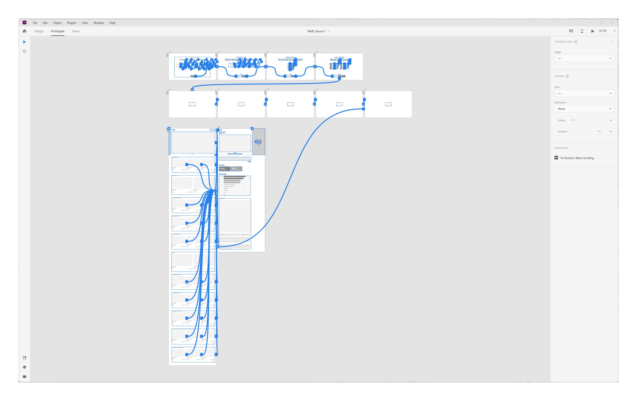
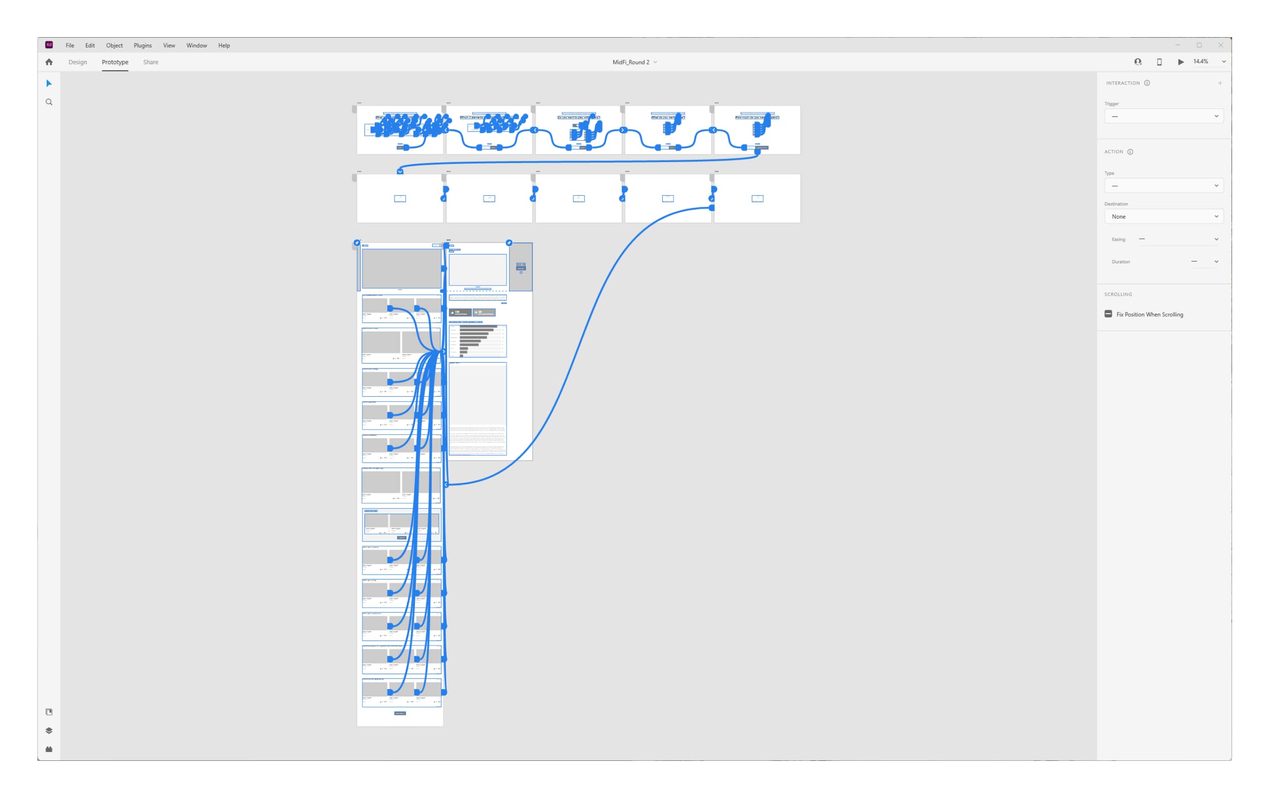
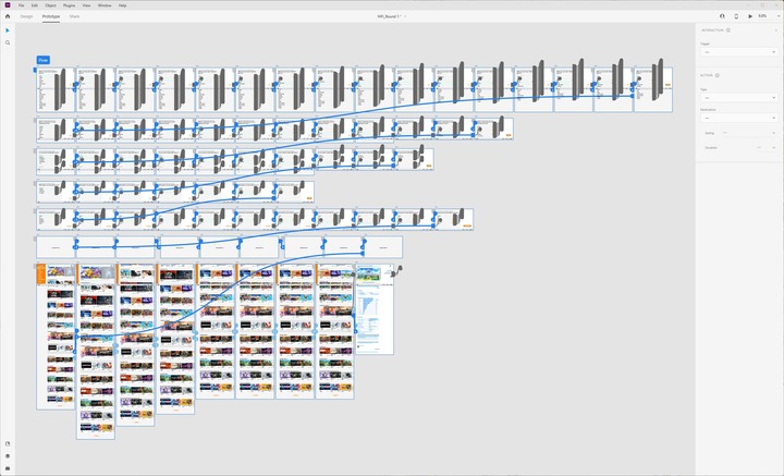
Mid-Fidelity Wireframes
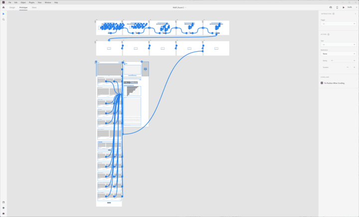
- I worked in Adobe XD to block out the structure of each screen.
- I added rough copy to key steps in the flow.
- I used Adobe XD’s prototyping tools to connect the screens.
Usability Tests
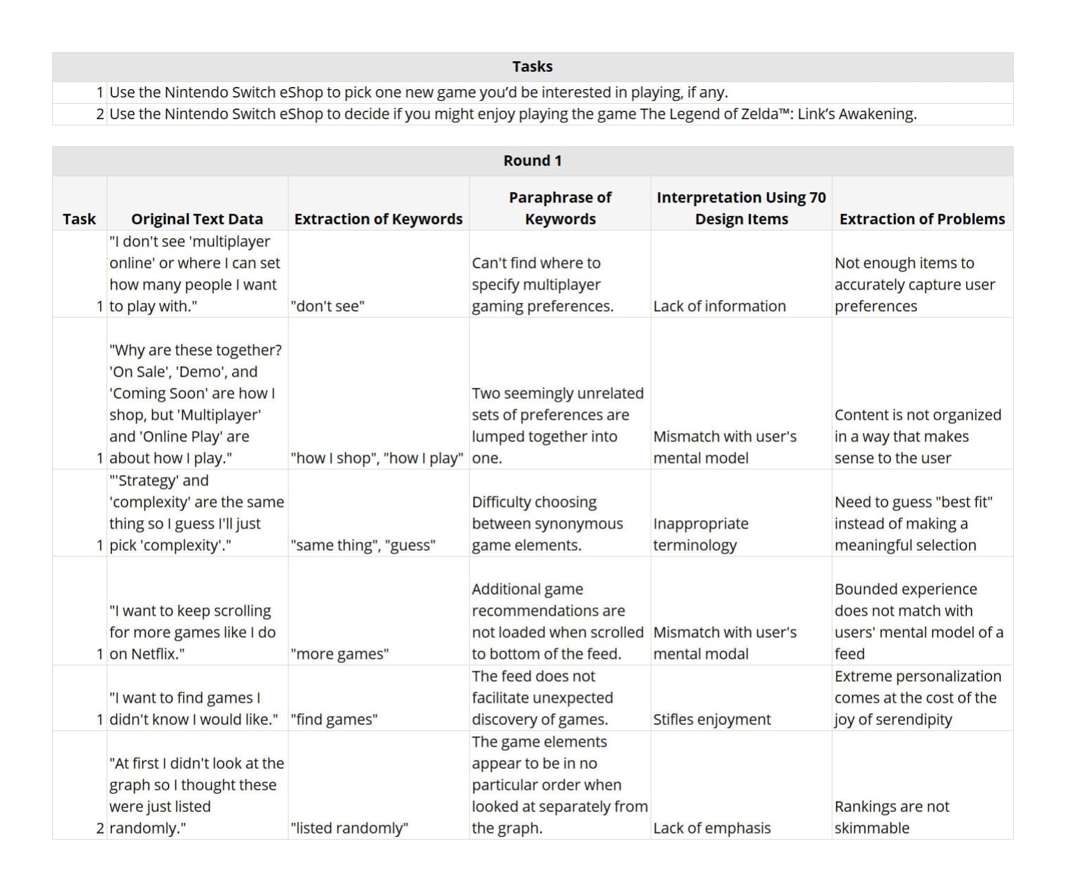
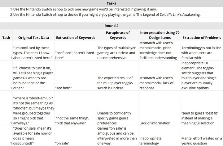
- I wrote tasks for the participants to perform:
- Use the Nintendo Switch eShop to pick one new game you’d be interested in playing, if any.
- Use the Nintendo Switch eShop to determine if you might enjoy playing the game The Legend of Zelda™: Link’s Awakening.
- I recruited two participants for each round of testing.
- I facilitated in-person usability tests on a tablet using the think-aloud method.
Revisions
- I analyzed the test results using the textual analysis method proposed by Toshihisa Doi (2021). Doi’s method uses step codingA multi-step process for analyzing textual data. and 70 design itemsA list of guidelines for product design. to extract usability problems.
- I tweaked the wireframes to address the usability problems identified.
Why did I do it?
My goals were to:
- define the information architecture,
- understand the users’ thinking process,
- verify that tasks can be easily completed, and
- correct usability problems.
What was the result?
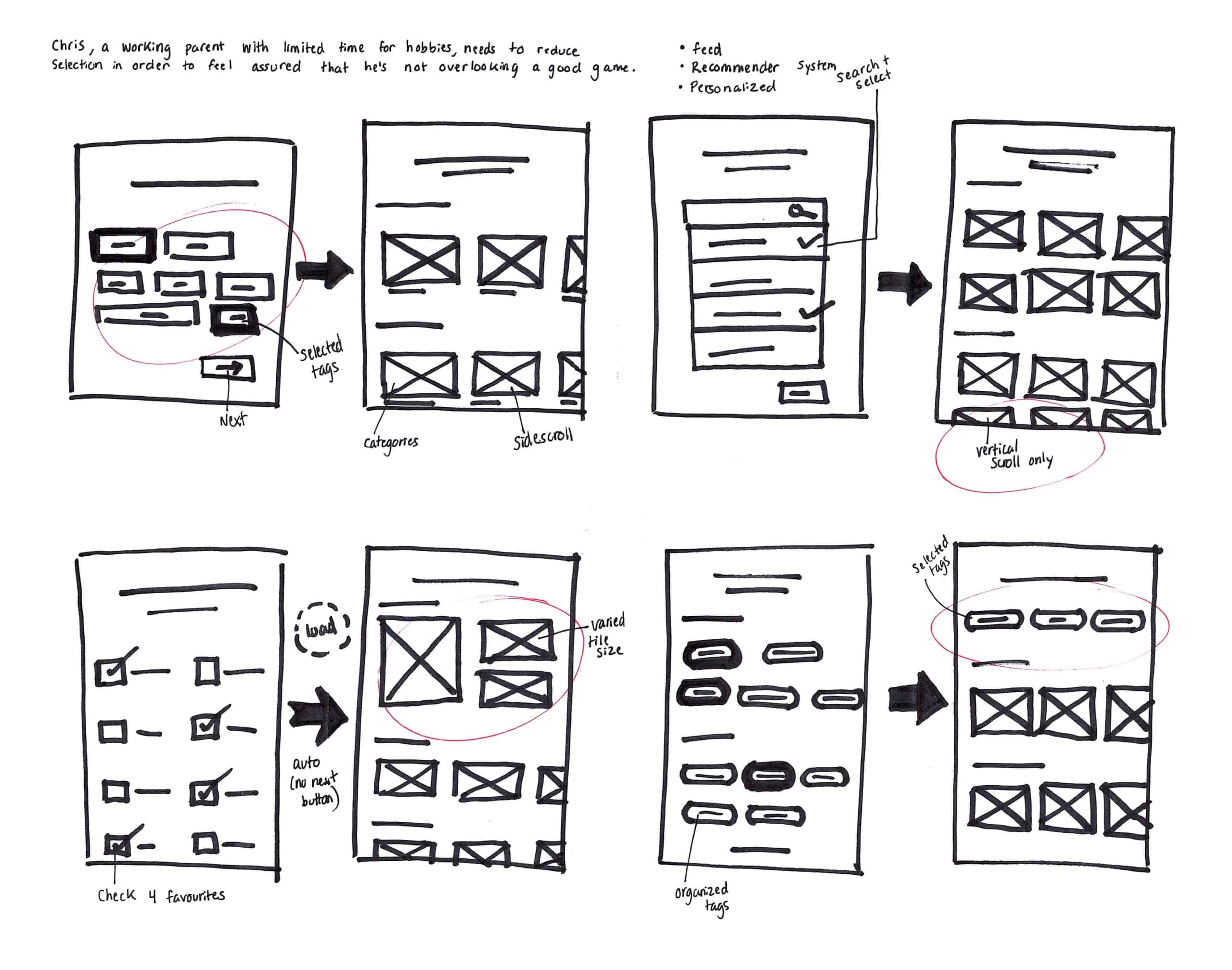
Wireframes Round #1
Usability Tests Round #1

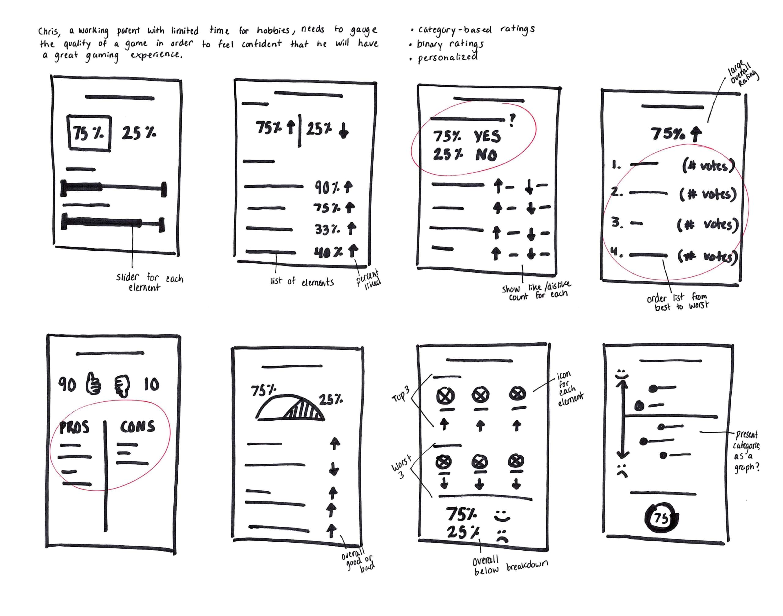
Wireframes Round #2
Usability Tests Round #2
What did I learn?
- A mismatch with the users’ mental model was the root cause of most usability problems identified.
- Users successfully picked a game, however, the anticipation built during the feed set up faded once the feed generated because the discovery was not serendipitous.
High-Fidelity Wireframes
What did I do?
I created high-fidelity, clickable wireframes.
How did I do it?
- I worked in Adobe XD to add details to the medium-fidelity wireframes, including spacing, typefaces, colours, and actual content.
- I used Adobe XD’s prototyping tools to connect the screens and add interaction such as touch gestures.
Why did I do it?
My goals were to:
- capture the look and feel of the eShop, and
- give a realistic preview of the user experience.
What was the result?
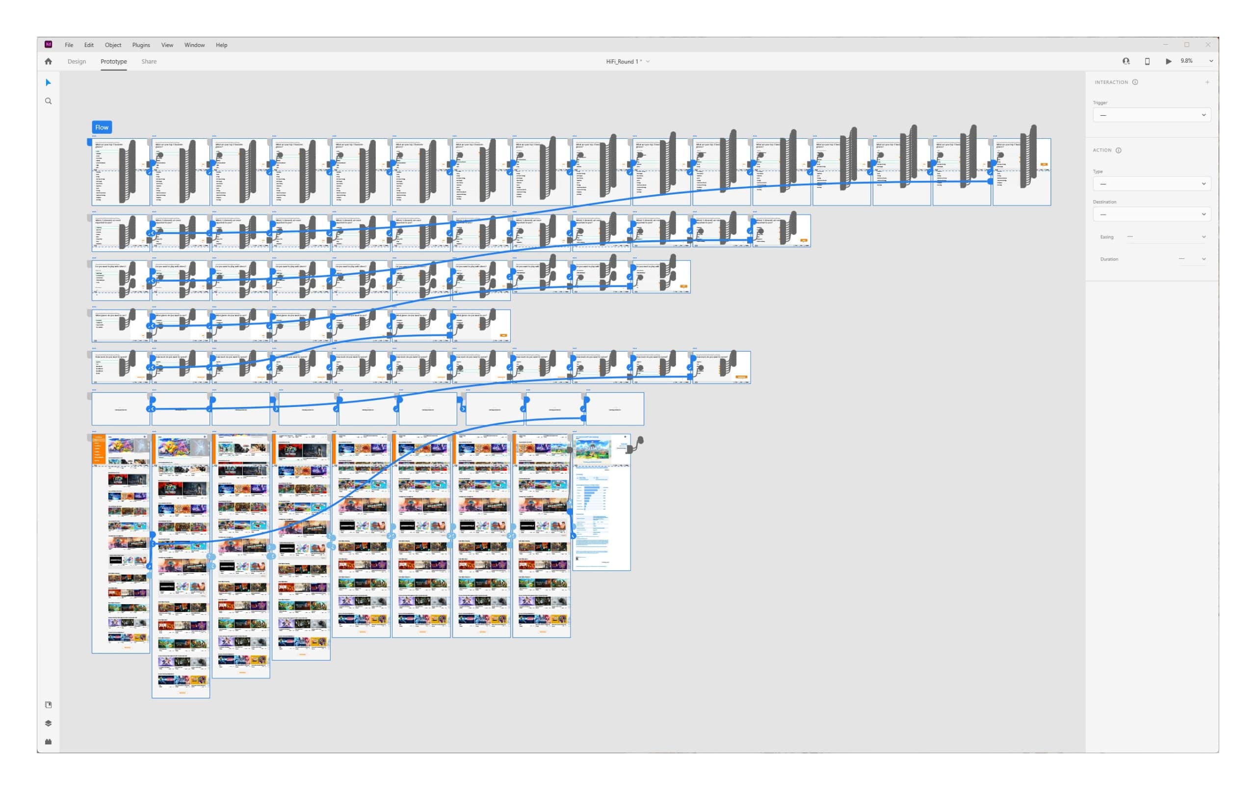
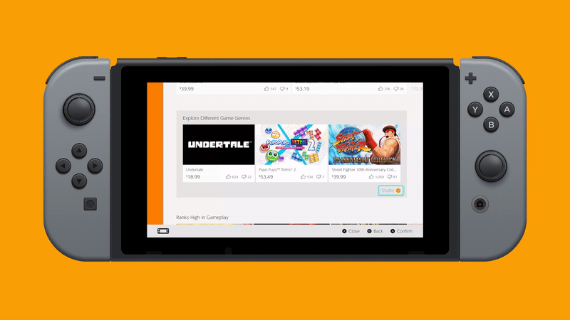
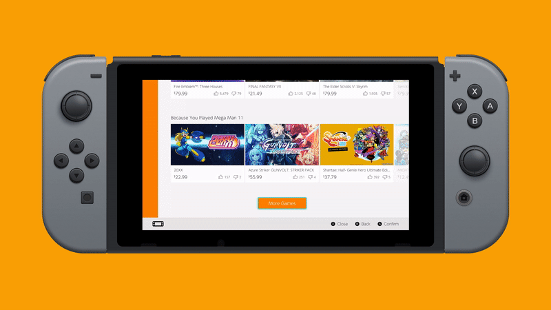

What did I learn?
The risk of implementing the home feed and the rating system is reduced because they can be can be inserted without completely redesigning the interface.
Conclusion
Results and impact
Before:
“I can’t stand the eshop. I usually browse in dekudeals.com [a website that tracks the prices of games on the eShop] and then buy it in the eshop.” — Comment from forum post
After:
“I’m actually looking forward to going through my picks [of recommended games on the eShop]!” — Usability test participant
The difference in sentiment expressed above show that the design helped users discover quality games and that it would increase the amount of time users spend in the eShop.
Main challenge and lesson learnt
A challenge I faced in this project was a mismatch between the information architecture and the users’ mental model. I resolved the mismatch by reorganizing the content according to user feedback, however, conducting a card sort prior to prototyping would have been valuable.
Next steps
This project satisfied two small-scope user need statements within a larger problem statement and, if I ran another sprint, I would address additional user needs that contribute to the overarching goal. I would also facilitate further usability testing to increase the sample size and ensure results represent the targeted user type.
In this project:
- Overview
- Stage 1: Empathize
- Sort and Measure
- Affinity Diagramming
- Empathy Mapping
- User Journey Mapping
- Stage 2: Define
- User Persona
- User Need Statements
- Stage 3: Ideate
- Braindump
- SCAMPER
- User Flow
- Crazy 8’s
- Stage 4/5: Prototype/Test
- Mid-Fidelity Wireframes & Usability Testing
- High-Fidelity Wireframes
- Conclusion