Overview
The problem
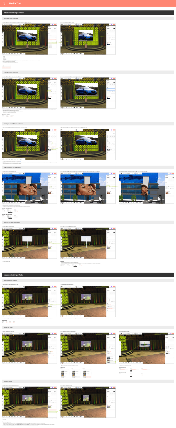
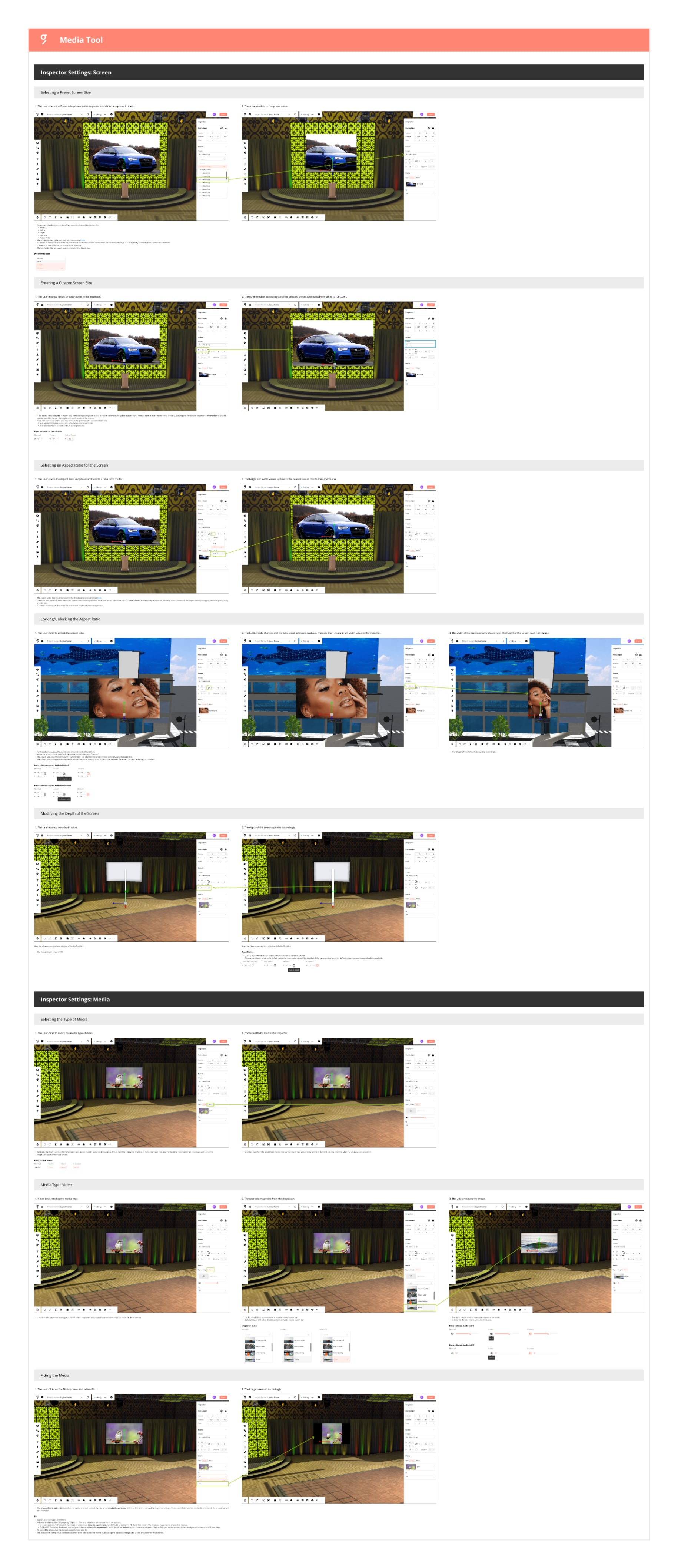
Feedback from pilot users on Geogram’s Media toolThe Media tool allows users to display images and videos inside a 3D space. revealed usability issues with sizing and formatting; positioning in 3D space; and media controls and organization. The project goal was to redesign the Media tool to improve usability and increase the likelihood of converting pilot users into paying customers.
The solution
The Media tool’s inspector was restructured and its behaviour was modified to better match the users’ mental model; to improve internal and external consistency; and to decouple the controls of the screen and the content.
My role
As the Product Designer, I completed tasks in all four phases of the double diamond design process, collaborating with cross-functional team members along the way. I ran discoveries with the Founder/CEO, presented solutions to project stakeholders for approval, and prepared deliverables for handover to developers.
Phase 1: Discover
Interactive Product Demos
What did I do?
With the company’s founder/CEO, I ran interactive product demos for two groups of pilot users who are audio-visual experts. The first group had 2 users and the second group had 3 users.
How did I do it?
I repeated the following steps for both groups in remote, hour-long demos.
- I gave an overview of Geogram.
- I invited users to collaborate with me in a layoutA Geogram layout is like a 3D Google Doc in which people can design spaces in a 3D replica of a physical location..
- I observed users as they worked and took note of feedback, issues, and requests.
Why did I do it?
Our goals were to:
- get feedback from users who represent Geogram’s target market,
- evaluate usefulness,
- discover feature gaps, and
- identify usability issues.
What was the result?
We made the following discoveries about the Media tool:
- Users struggle to place the Media tool against walls in the 3D space.
- Users feel that resizing the Media tool requires too much effort.
- Users get annoyed when the Media tool resizes automatically to fit its content.
- Users want to know the exact dimensions of the Media tool without measuring it themselves.
What did I learn?
- The user flow doesn’t match the users’ actual workflow. In the happy path, users should select content and then set up the screen, but in reality, users do the opposite. This mismatch heightens issues with sizing and creates extra work.
- The Media tool is difficult to place against surfaces, leading users to search for ways to make it easier. For example, looking for a skew tool to help place it in perspective.
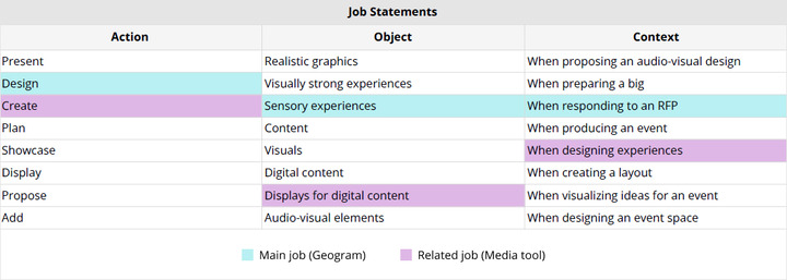
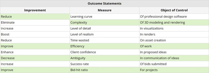
Jobs-to-Be-Done
What did I do?
I wrote a job-to-be-done (JTBD) statement representing the task users hope to achieve with the Media tool.
How did I do it?
- I reviewed findings from the interactive product demos.
- I brainstormed jobs, then selected a main and related job that best reflected the users’ task.
- I brainstormed desired outcomes, then identified the ones that best captured what users want to achieve.
- I combined the jobs and desired outcome into a complete JTBD statement.
- I wrote functional and emotional success criteria.
Why did I do it?
My goals were to:
- understand the situation that triggers the users’ need,
- identify what users want to accomplish and why, and
- determine the criteria users consider when evaluating the Media tool.
What was the result?

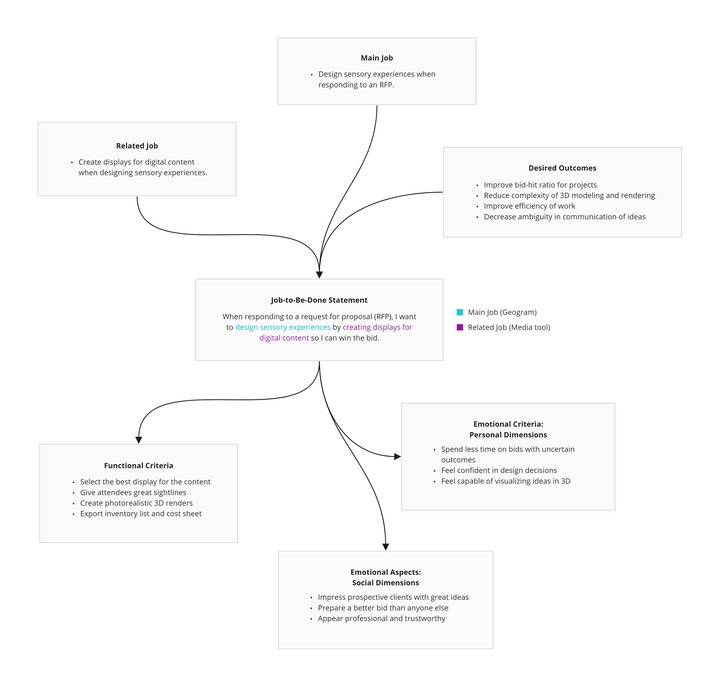

What did I learn?
Users need the Media tool before even having access to their prospective client’s content. As a result, users must be able to create displays on which the content can be easily changed, without redoing work or modifying the design.
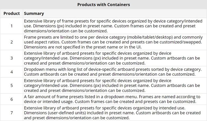
Heuristic Evaluation
What did I do?
I conducted a heuristic evaluation of the Media tool using Jakob Neilsen’s 10 Usability Heuristics for Interface Design.
How did I do it?
- I walked through the process of using the Media tool and took screenshots.
- I identified heuristic violations in the behaviour, flow, and interface.
- I rated the severity of each violation.
- I did a braindump of potential solutions for each violation.
Why did I do it?
My goals were to:
- assess the interface,
- detect usability issues and evaluate their impact on the user experience, and
- begin to identify opportunities for improving ease of use.
What was the result?
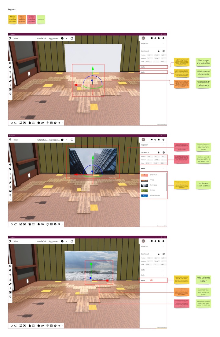
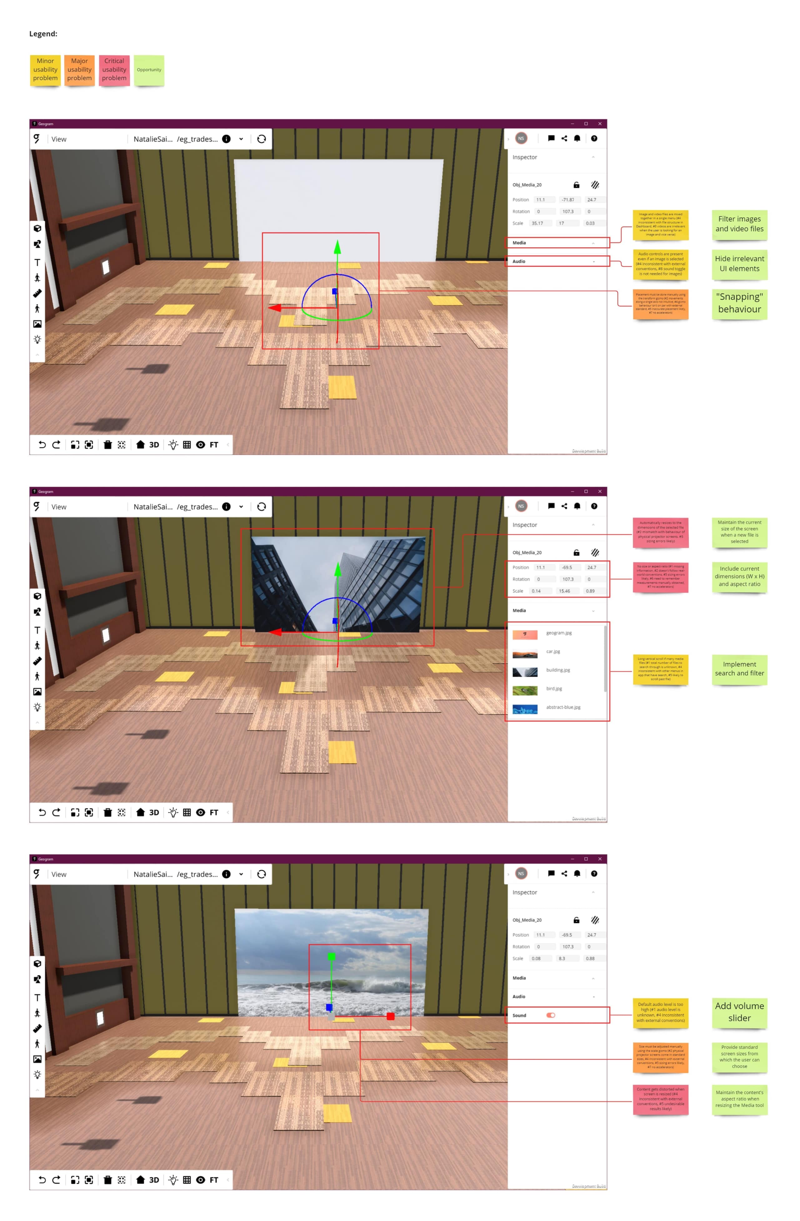
Most major and critical violations are of the following heuristics:
- error prevention
- match between system and the real world
- consistency and standards
- flexibility and efficiency of use
What did I learn?
Mistakes are likely to be made because:
- The Media tool doesn’t match the users’ experience with physical projector screens.
- Conventions set by other software aren’t followed.
- Functionality isn’t consistent internally.
- The user flow isn’t flexible.
Desk Research
What did I do?
I analyzed existing products offered by indirect competitors and conducted personal research on projector screens.
How did I do it?
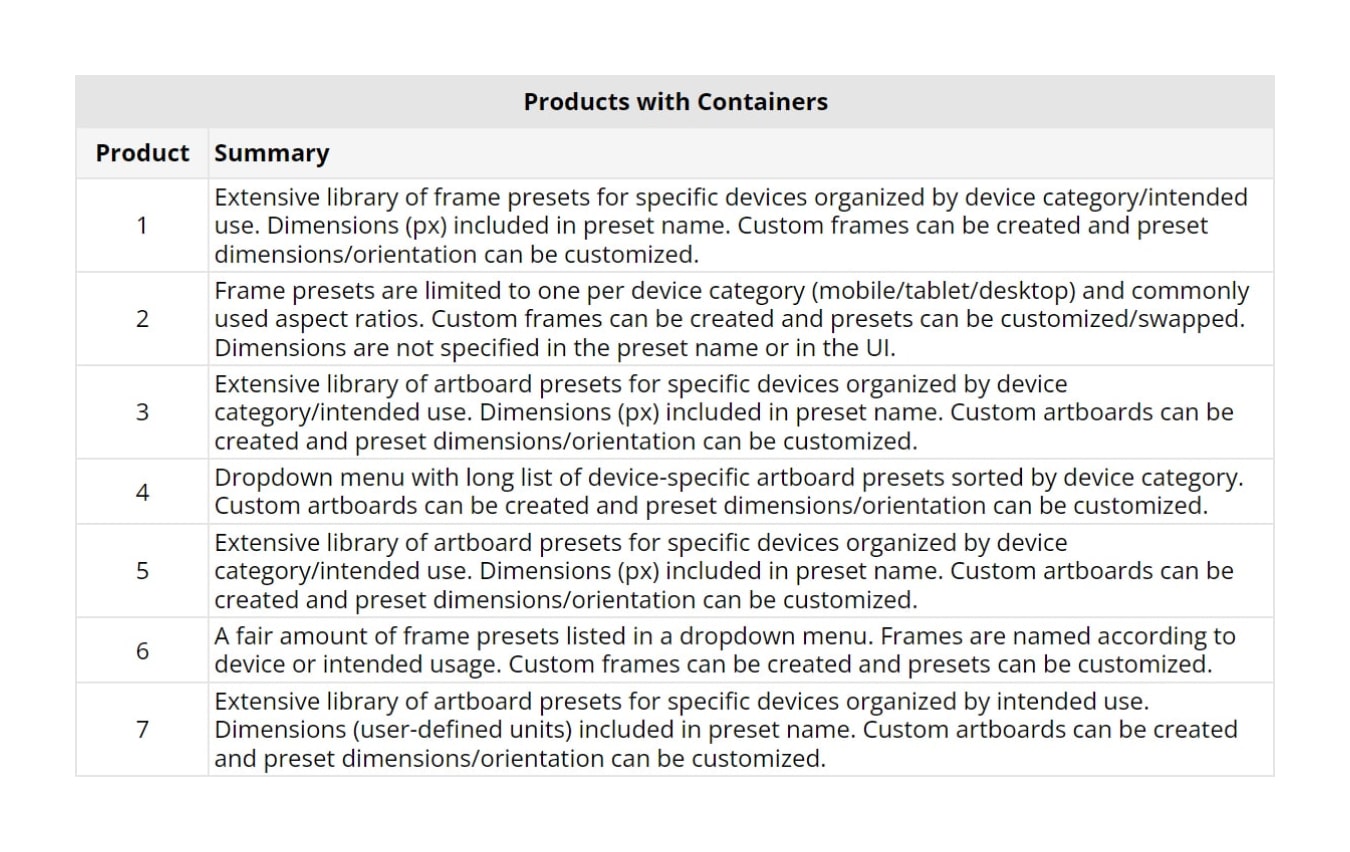
Existing Product Analysis
- I referenced a list of indirect competitors that I previously identified.
- I used the competitors’ products, focusing on relevant features only.
- I created a visual board in MiroA whiteboarding platform. of annotated screenshots.
- I wrote summary statements for each product I analyzed.
Personal Research
- I ran web searches of terms such as “choosing projector screen” and “standard projector screen sizes”.
- I added key findings to a research board in Miro.
Why did I do it?
My goals were to:
- Learn what is a standard experience by uncovering commonalities between existing products.
- Better understand the user’s mental model of projector screens by learning how they’re sold, purchased, used, etc.
- Derive insights to support decision making in the Definition phase of this project.
What was the result?
What did I learn?
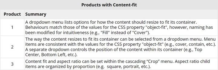
- Existing products allow users to create containers (i.e., frames or artboards) of any size, but also offer customizable presets organized into broad categories.
- Containers are fixed in size and don’t automatically resize to fit their content.
- Users should be able to choose how the content fits within its container.
- Image diagonal is a commonly used measurement when buying a projector screen.
- Projector screens are usually organized by format (e.g., widescreen, HDTV, etc.) and then by size in inches.
Phase 2: Define
How Might We Questions
What did I do?
I wrote “How might we” (HMW) questions to address the usability issues.
How did I do it?
- I reviewed the usability issues identified in Phase 1.
- I sorted the usability issues into common themes.
- I brainstormed possible HMW questions for each theme.
- I selected the HMW questions that best reflected the users’ problems and desired outcomes.
Why did I do it?
My goals were to:
- reframe learnings into actionable insights, and
- bring focus to the right problems to solve.
What was the result?

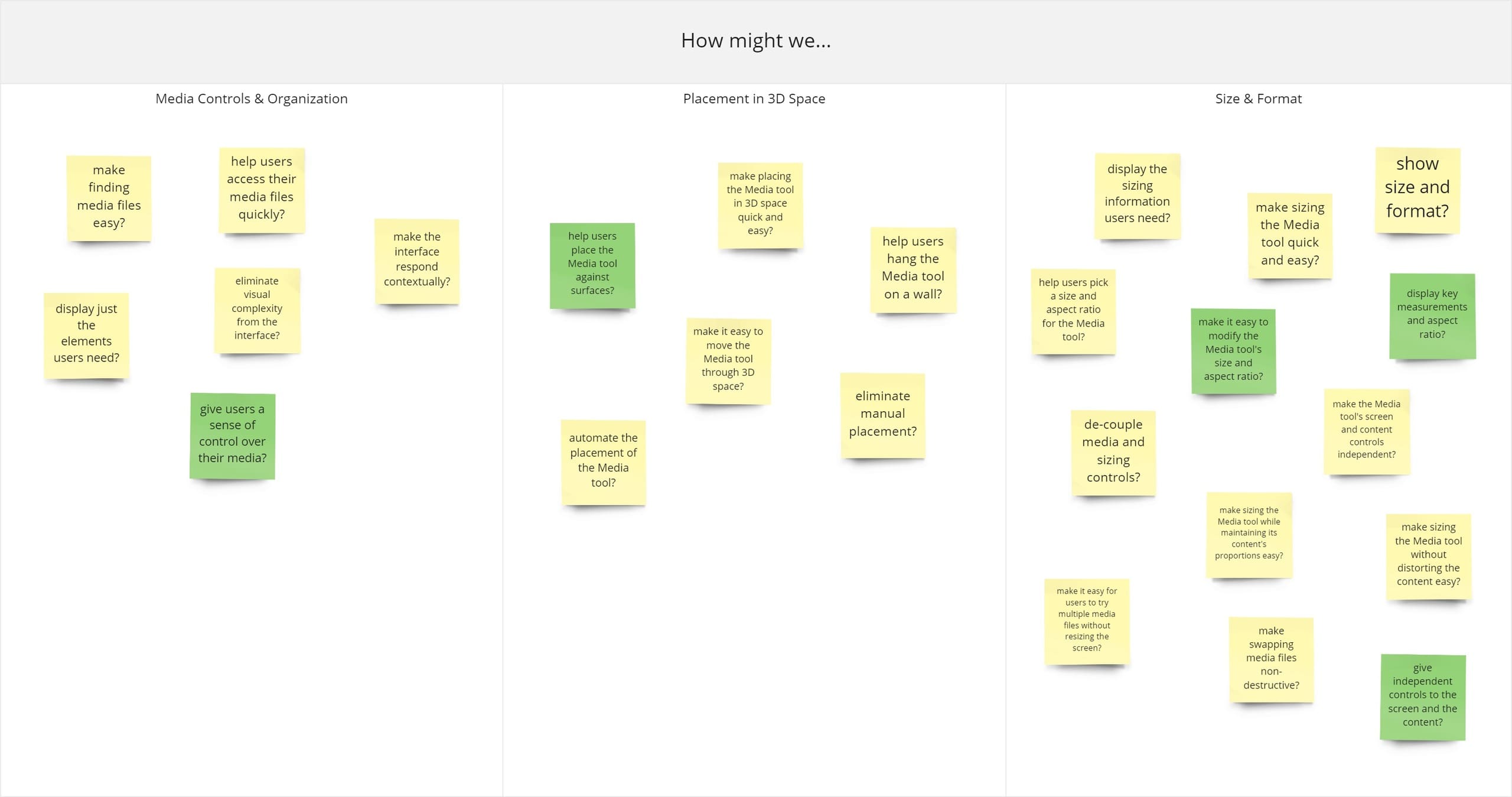
The following questions were defined:
- HMW give users a sense of control over their media?
- HMW make placing the Media tool against surfaces quick and easy?
- HMW help users identify the Media tool’s size and aspect ratio?
- HMW make resizing the Media tool and changing its aspect ratio quick and easy?
- HMW give users independent controls over the screen and the media?
What did I learn?
Ideation will need to focus on three problem areas:
- Media controls and organization
- Positioning in 3D space
- Size and format
Phase 3: Develop
Crazy 8’s
What did I do?
I used the Crazy 8’s sketching technique to explore the problem areas and HMW questions.
How did I do it?
Working in Miro, I repeated the following steps for each problem area:
- I wrote the problem area and related HMW questions at the top of my Crazy 8’s template.
- I set an 8-minute timer and sketched one idea per screen.
- I identified the best ideas.
Why did I do it?
My goals were to:
- generate many ideas in a short period of time, and
- identify elements to explore further.
What was the result?

What did I learn?
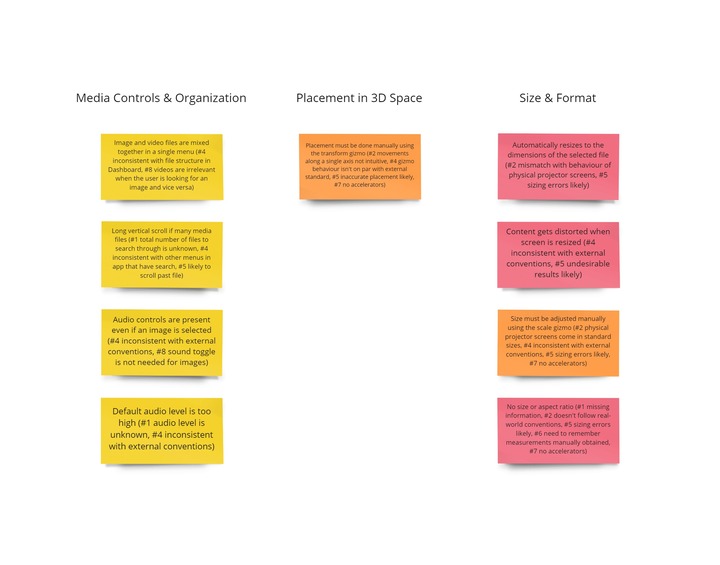
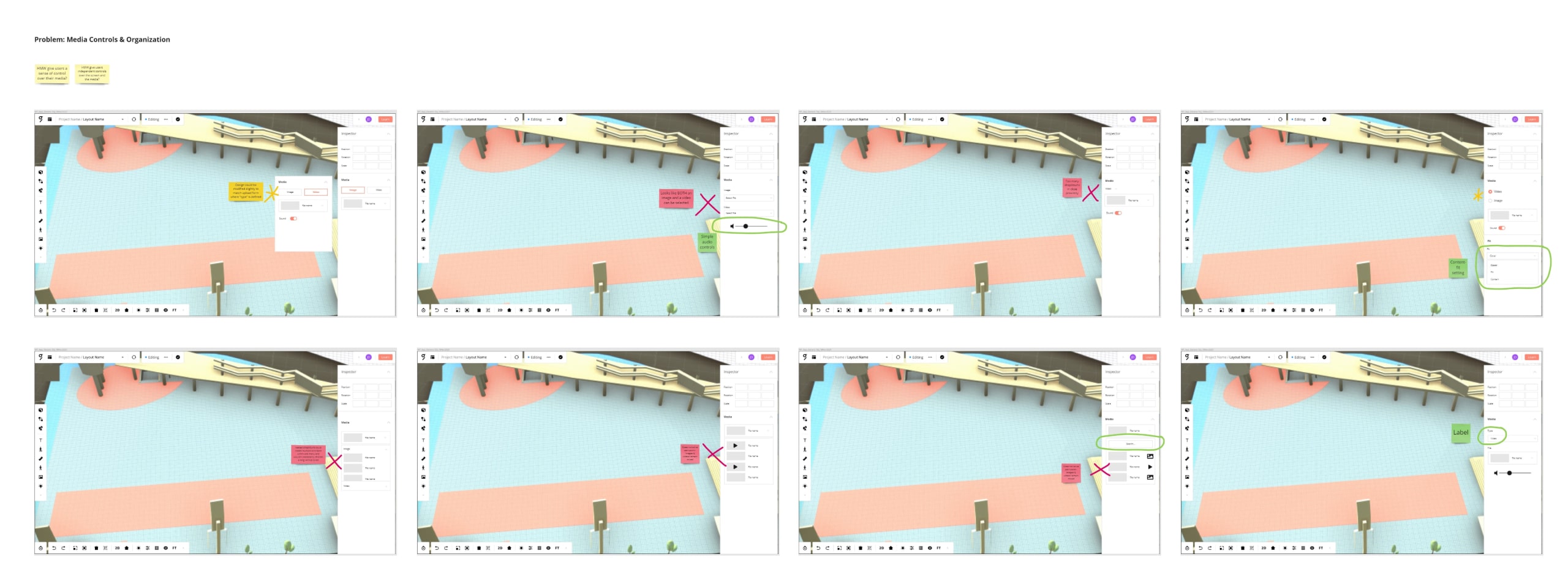
Problem area #1. Media controls and organization
- Organizing files by type and adding search with list filtering could improve internal consistency and make finding files quicker.
- Displaying audio controls only if a video is selected could reduce visual complexity.
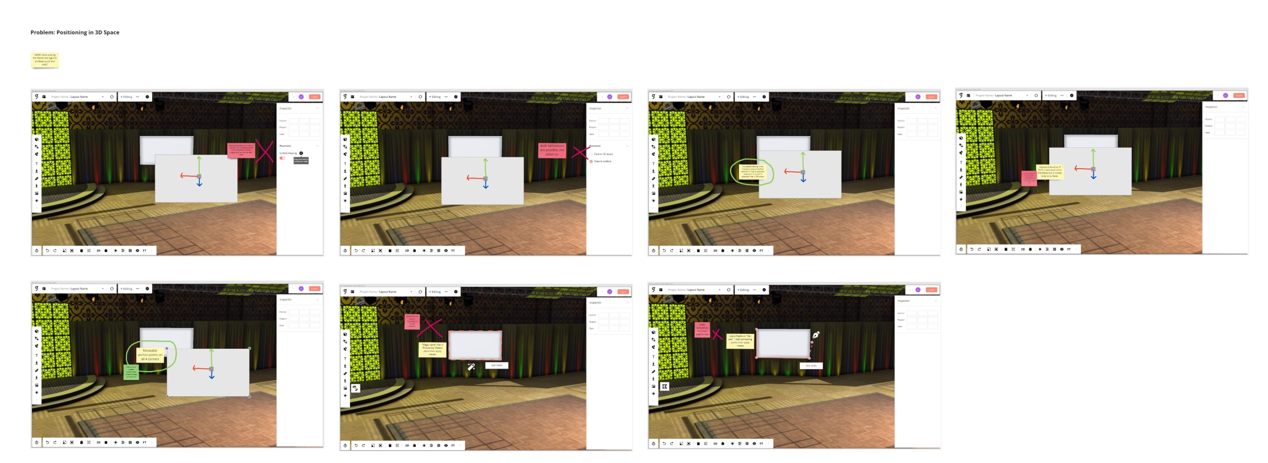
Problem area #2. Positioning in 3D space
- Snap-to-surface could minimize the burden from manual placement and would be consistent with the current snap-to-grid behaviour.
Problem area #3. Size and format
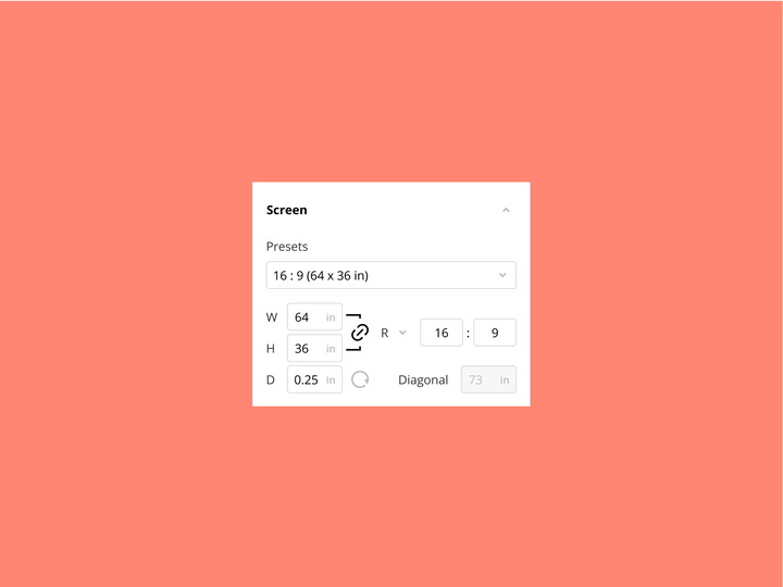
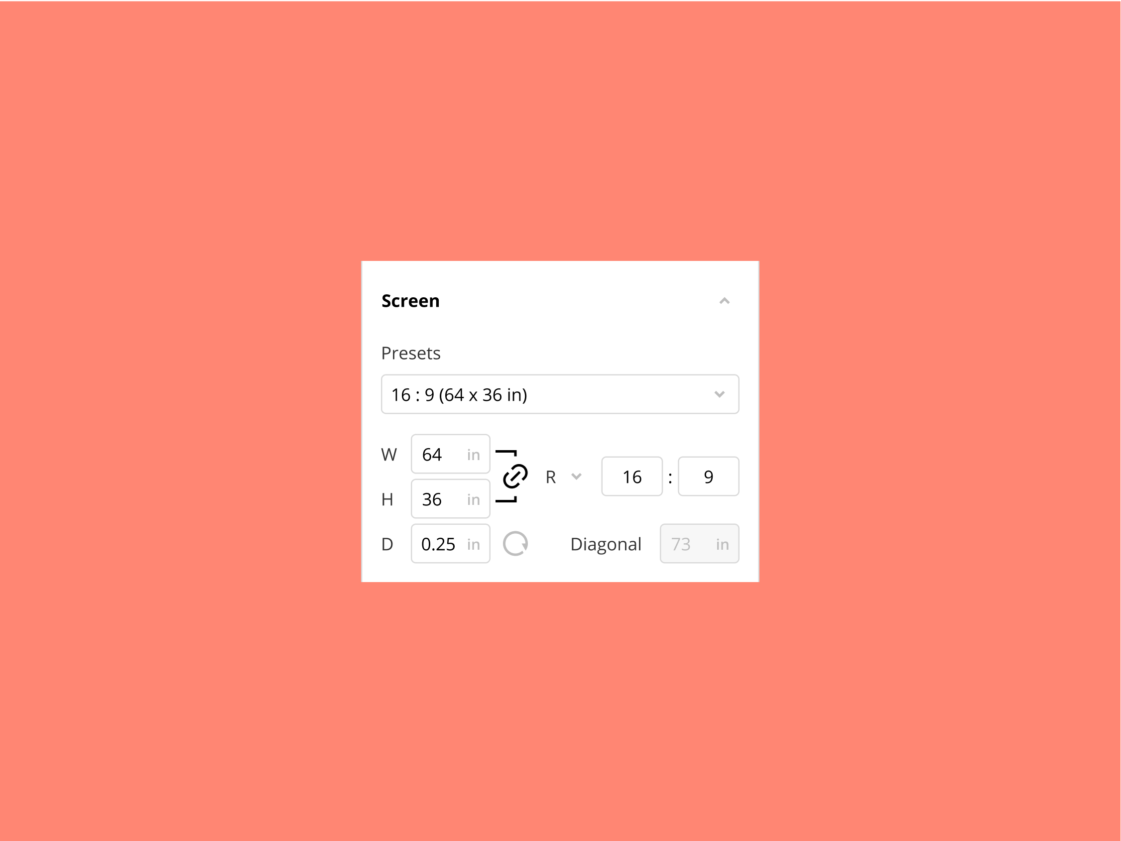
- Dimensions and aspect ratio could be displayed in the inspector.
- Presets could allow users to set size and aspect ratio with just two clicks.
- Input fields could allow users to enter values instead of using the scale gizmo.
- The Media tool could be restructured into two sub-components (i.e., the screen and the content), each with independent controls.
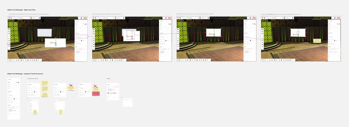
Medium-Fidelity Wireflow & Design Review
What did I do?
I created a medium-fidelity wireflow and had it reviewed by project stakeholders, including the company’s founder/CEO, project manager, and lead Unity developer.
How did I do it?
Medium-Fidelity Wireflow
Working in Miro, I:
- Made a user flow diagram.
- Sketched one screen per step in the user flow, further exploring ideas generated in the Crazy 8’s exercise.
- Drew arrows from interaction to interaction.
- Annotated each screen.
Design Review
- I scheduled a Google Meet with the company’s founder/CEO, project manager, and lead Unity developer.
- I walked through the wireflow.
- We assessed the design against the requirements and discussed priorities for implementation.
- I took note of questions, suggestions, and revisions required.
Why did I do it?
Our goals were to:
- ensure the revised design addressed usability issues,
- determine feasibility of implementation, and
- avoid feature creep.
What was the result?
What did I learn?
- Snap-to-surface will be added to the product backlog because of out-of-scope technical dependencies. To improve positioning within scope, we decided to instead remove the Media tool’s default rotation. The Media tool is most often placed against straight walls and eliminating the need to straighten it would alleviate the burden of placement.
- Adding a field for screen thickness would make the Media tool visible from the side and could increase versatility, allowing users to design other types of displays (e.g., LED walls).
Phase 4: Deliver
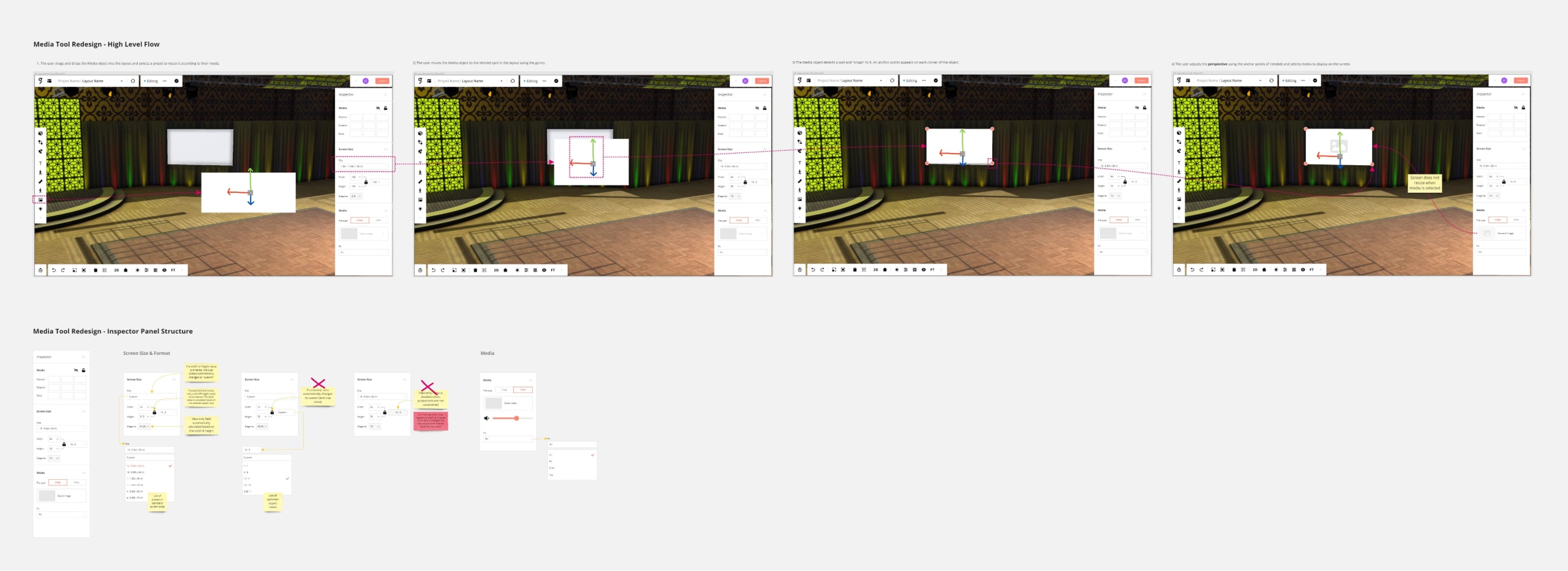
High-Fidelity Wireflow & User Stories
What did I do?
I created a high-fidelity wireflow and wrote user stories for developers.
How did I do it?
High-Fidelity Wireflow
Working in FigmaA cloud-based design tool for interface design., I:
- Pulled components from a design framework and our design system.
- Made a detailed mock-up for each step in the user flow according to the approved medium-fidelity wireflow.
- Drew arrows from interaction to interaction.
- Annotated each screen.
User Stories
I divided the high-fidelity wireflow into small parts then, in ClickUpA project management software., I:
- Wrote a user story for each part.
- Wrote acceptance criteria for each user story.
- Posted a link to the corresponding part of the wireflow.
Why did I do it?
My goals were to:
- refine changes to the interface,
- give a realistic preview of the revised user experience, and
- clearly define tasks for developers.
What was the result?

What did I learn?
Problem areas and related user stories should be worked on in the following order to ensure each task stands on its own while keeping priorities:
- Remove default rotation (quick win, major usability issue).
- Display size, followed by aspect ratio, and then presets of these values (major/critical usability issues).
- Implement content-fit, followed by media type filter, and then contextual controls (minor usability issues).
Conclusion
Results and impact
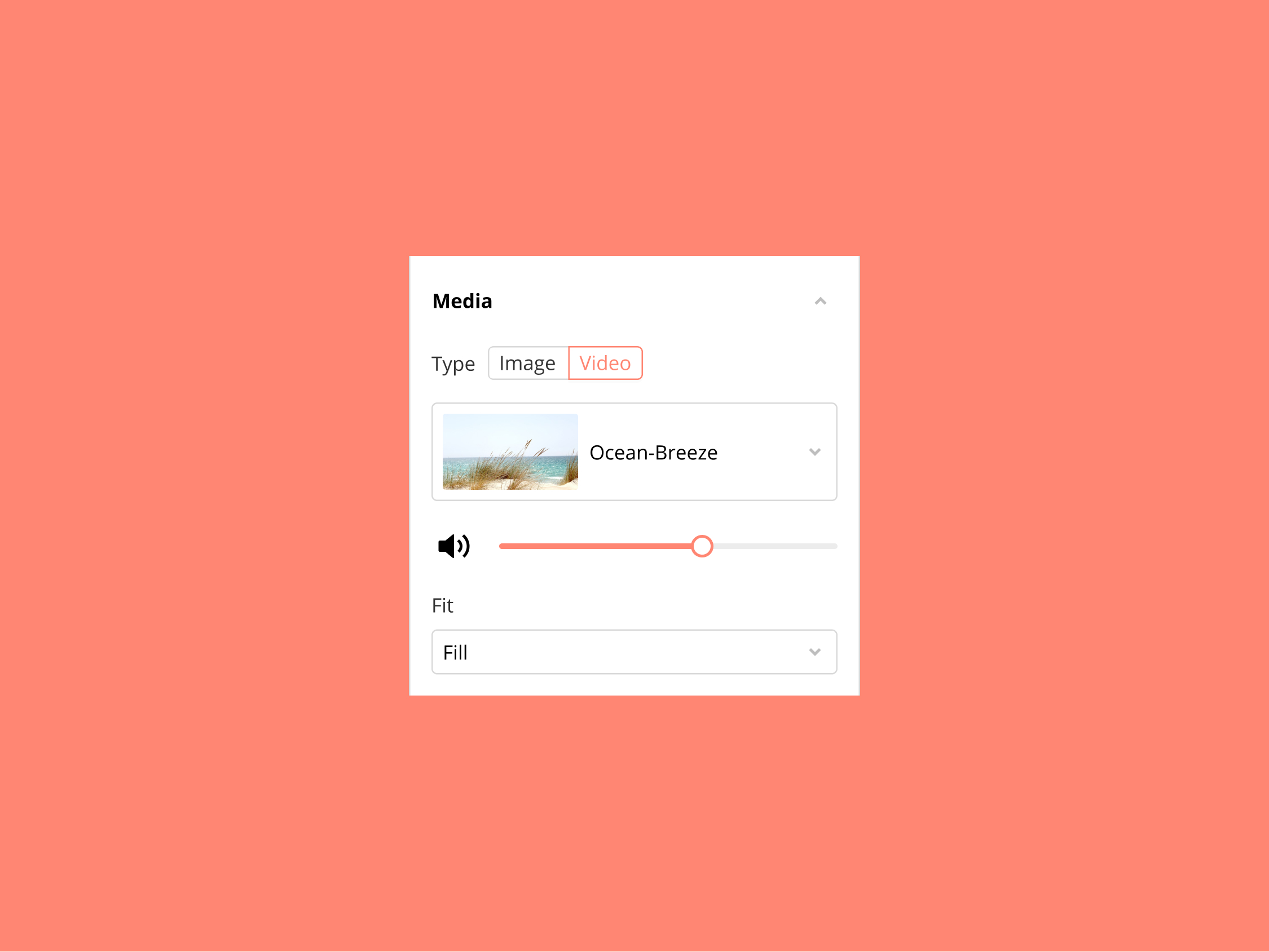
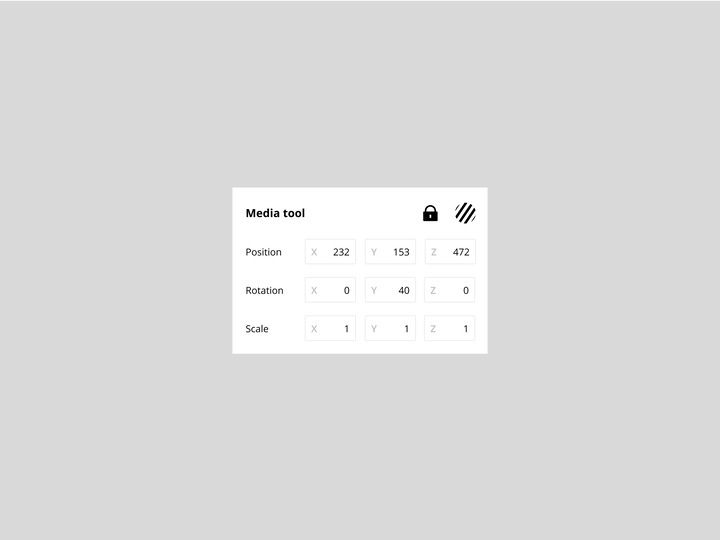
The comparisons below highlight how the revised structure for the Media toolThe Media tool allows users to display images and videos inside a 3D space.’s inspector and its modified behaviour improved usability in all three problem areas.
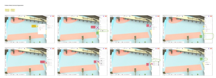
Problem area #1. Media controls and organization
Before: Image and video files were mixed together in the dropdown menu.
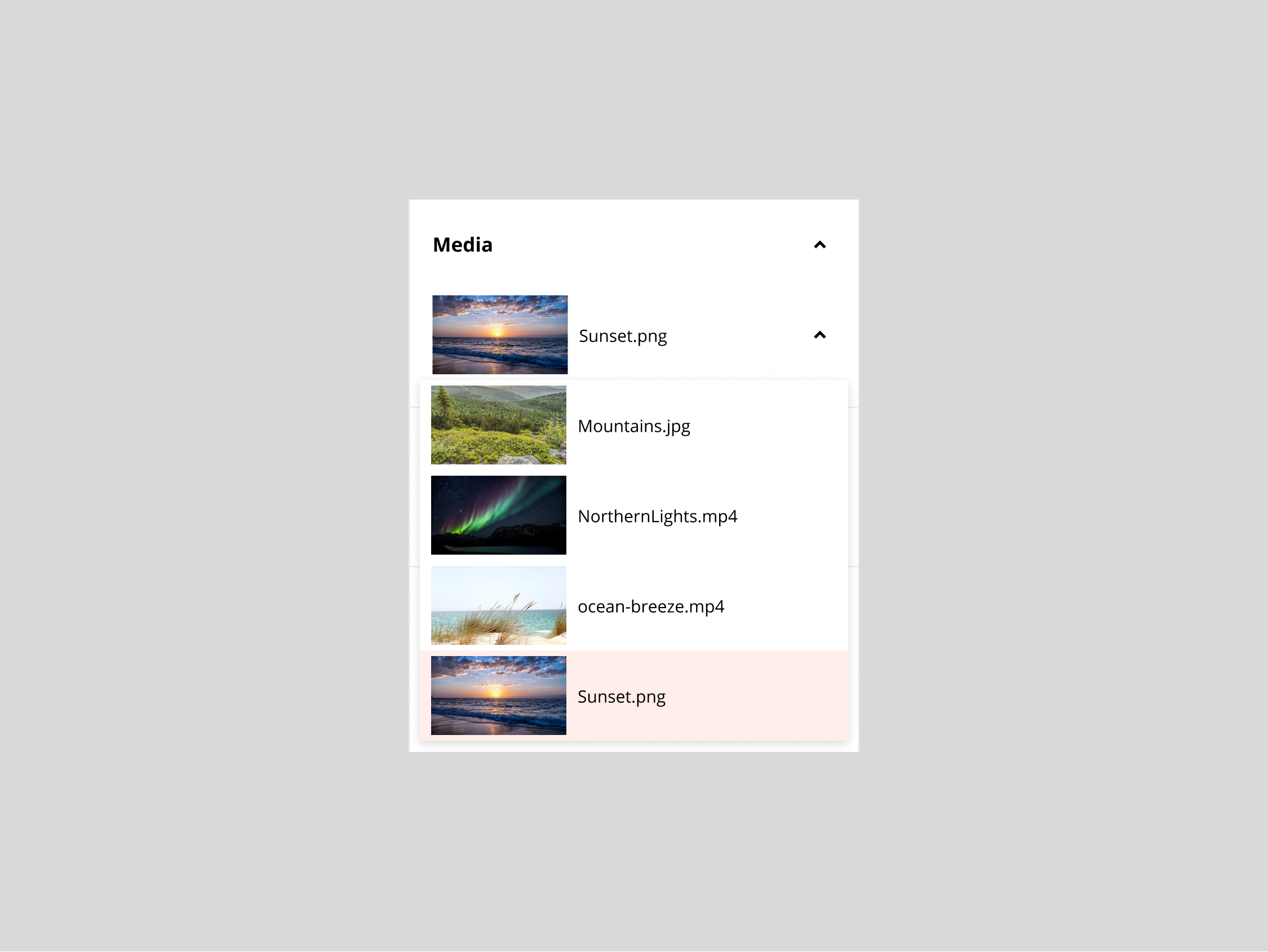
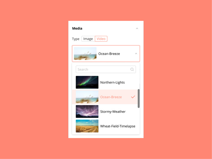
After: Only files matching the selected type are listed in the dropdown menu.
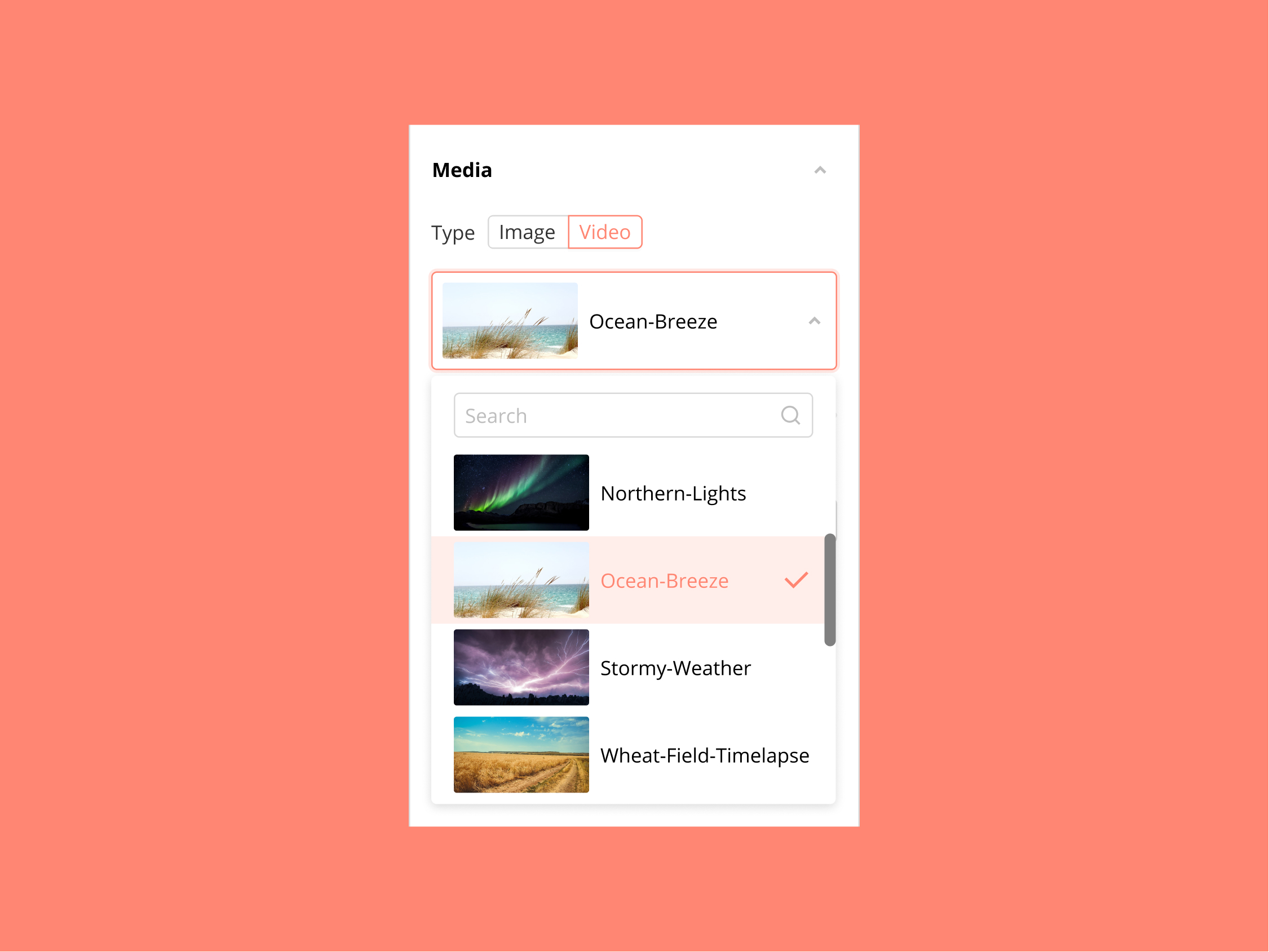
Before: Audio controls were displayed even if an image was selected.

After: Audio controls are only displayed if video is selected as the media type.

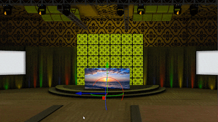
Problem area #2. Positioning in 3D space
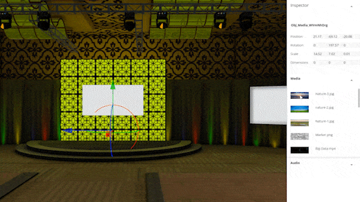
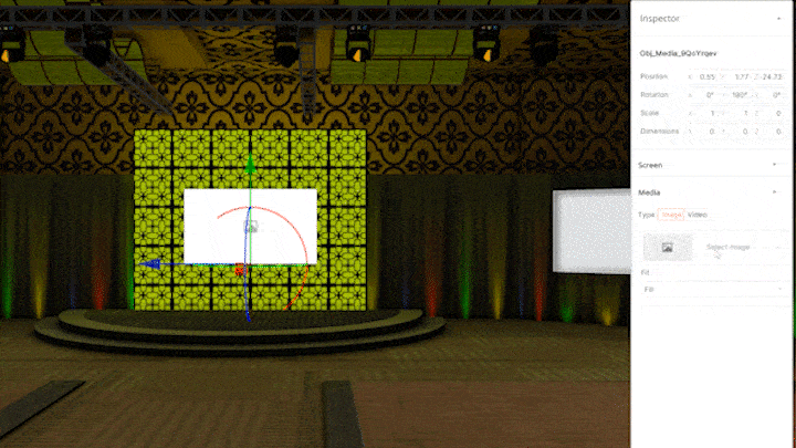
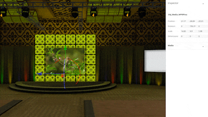
Before: The Media tool had to be straightened manually with the gizmo before it could be placed flat against a surface.
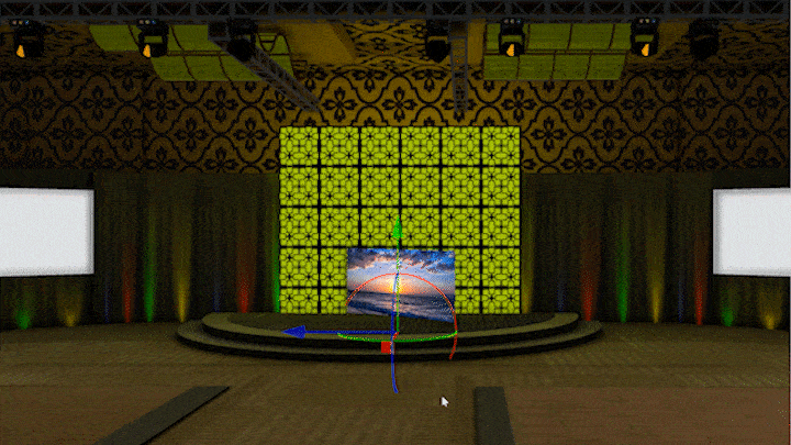
After: The Media tool is straight by default and only translations are needed to place it against a surface.
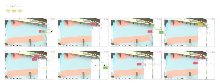
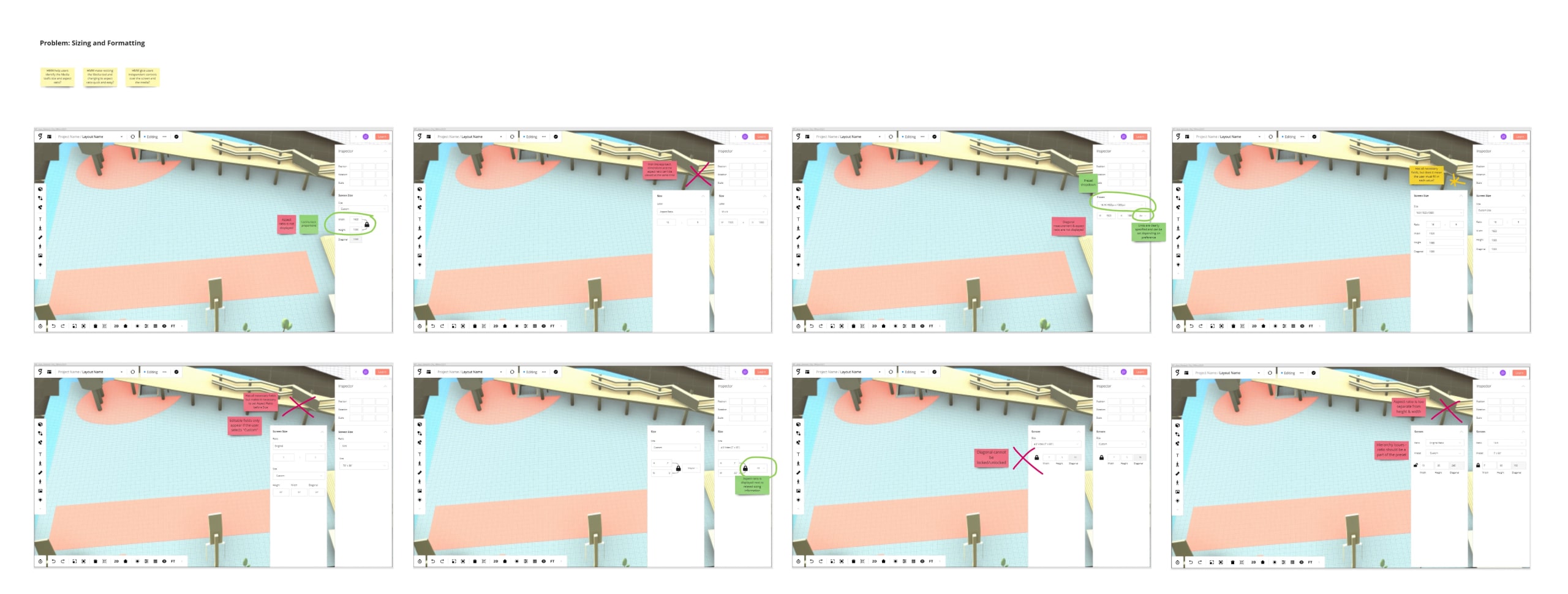
Problem area #3. Size and format
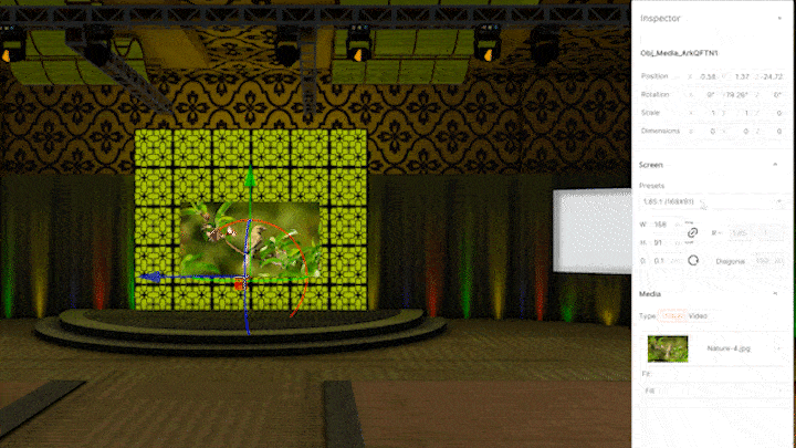
Before: Settings in the inspector were only for the media, not the screen.

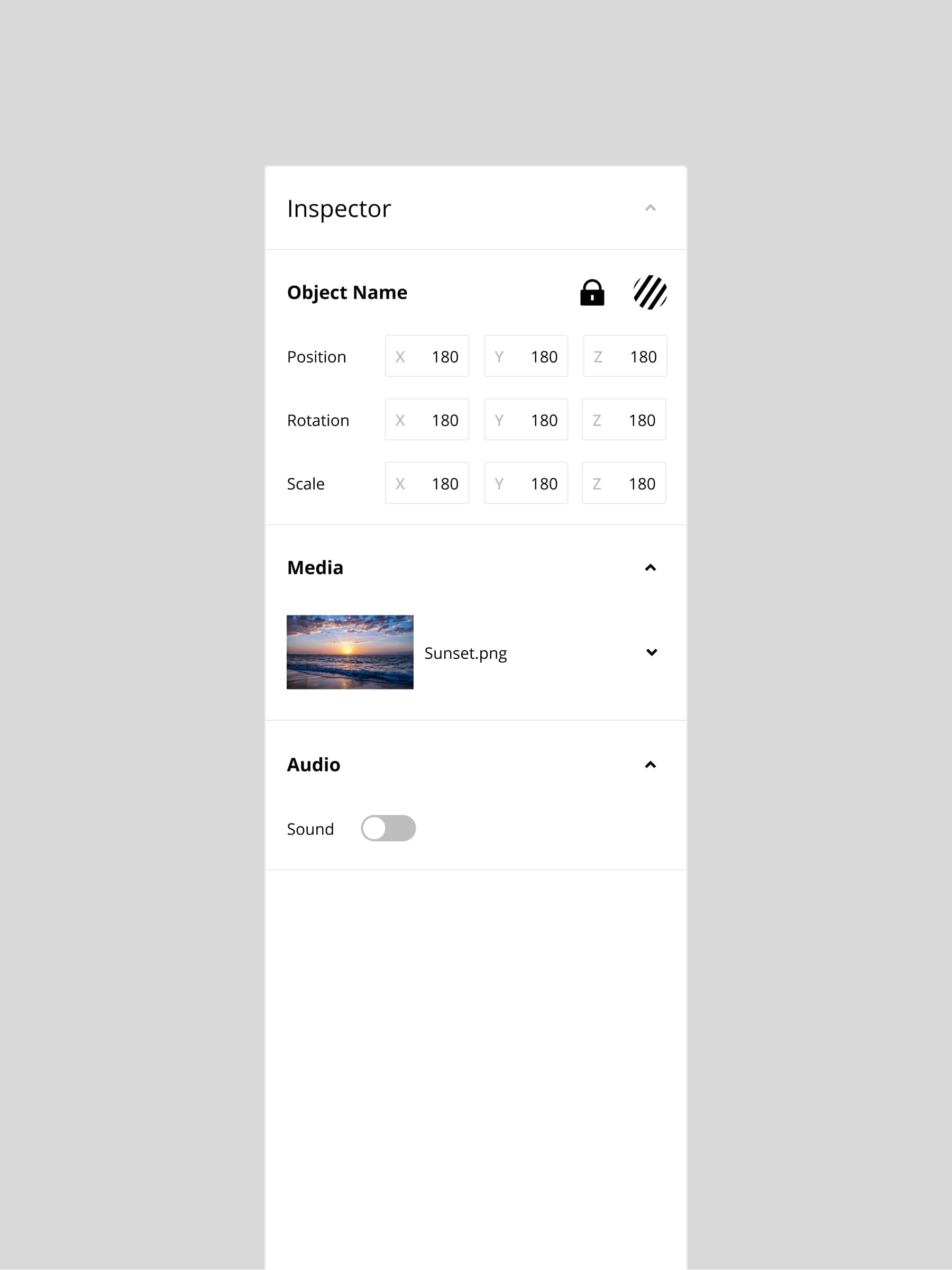
After: Screen-specific settings are included in addition to the media settings.
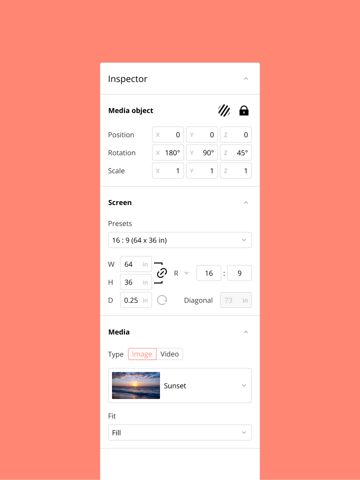
Before: No format or sizing information was displayed, only scale factorScale factor is the size of the Media tool relative to its base size, not its dimensions..
After: Current aspect ratio and dimensions are displayed in the users’ preferred units.
Before: Automatically resized to the pixel dimensions of the selected file.
After: Sizing is persistent. The selected file scales proportionally to either fill or fit the screen.
Before: Could only be scaled with the gizmo.
After: Can also be resized by entering dimensions or selecting a preset.
Main challenge and lesson learnt
A dependency blocked the implementation of the ideal solution for issues with positioning in 3D space; however, the project stakeholders and I identified a quick win to alleviate the severity of the problem while the dependency is cleared. The project also served as a reminder of the importance of understanding the users’ mental model, particularly in a product aiming to virtually replicate physical reality.
Next steps
Once implementation is complete, usability testing will be conducted to measure its impact. Future versions of the Media tool will also revisit out-of-scope ideas that emerged in this project, such as the ability to create presets or to customize the screen with accessories such as stands or frames.